Chapter 7 Data Visualization
Because some of the exercises require the skills of data manipulation, the assignments of Chapter 7 will be collected along with those of Chapter 8.
7.1 Why Visualization?
Data visualization is very important. I would like to illustrate this point with two interesting examples.
Datasaurus Dozen Dataset
First, let us take a look at an interesting dataset—Datasaurus, which is available in demo_data/data-datasaurus.csv (source: Datasaurus data package. This data set was first created by Alberto Cairo).
| group | x | y |
|---|---|---|
| dino | 95.38460 | 36.794900 |
| dino | 98.20510 | 33.718000 |
| away | 91.63996 | 79.406603 |
| away | 82.11056 | 1.210552 |
| h_lines | 98.28812 | 30.603919 |
| h_lines | 95.24923 | 30.459454 |
| v_lines | 89.50485 | 48.423408 |
| v_lines | 89.50162 | 45.815179 |
| x_shape | 84.84824 | 95.424804 |
| x_shape | 85.44619 | 83.078294 |
| star | 82.54024 | 56.541052 |
| star | 86.43590 | 59.792762 |
| high_lines | 92.24840 | 32.377154 |
| high_lines | 96.08052 | 28.053601 |
| dots | 77.92604 | 50.318660 |
| dots | 77.95444 | 50.475579 |
| circle | 85.66476 | 45.542753 |
| circle | 85.62249 | 45.024166 |
| bullseye | 91.72601 | 52.623353 |
| bullseye | 91.73554 | 48.970211 |
| slant_up | 92.54879 | 42.901908 |
| slant_up | 95.26053 | 46.008830 |
| slant_down | 95.44349 | 36.189702 |
| slant_down | 95.59342 | 33.234129 |
| wide_lines | 77.06711 | 51.486918 |
| wide_lines | 77.91587 | 45.926843 |
This data set includes 1846 rows (items), with three columns describing the properties of the items: group, x and y.
As we have a grouping factor group, we can break the data set into several subsets by group and for each subset we compute their respective mean scores and standard deviations of x and y.
According to the summary statistics of each sub-group (cf. Table 7.2), they all look quite similar in terms of each group’s mean and standard deviation of x and y:
| group | x_mean | y_mean | x_sd | y_sd |
|---|---|---|---|---|
| away | 54.266 | 47.835 | 16.770 | 26.940 |
| bullseye | 54.269 | 47.831 | 16.769 | 26.936 |
| circle | 54.267 | 47.838 | 16.760 | 26.930 |
| dino | 54.263 | 47.832 | 16.765 | 26.935 |
| dots | 54.260 | 47.840 | 16.768 | 26.930 |
| h_lines | 54.261 | 47.830 | 16.766 | 26.940 |
| high_lines | 54.269 | 47.835 | 16.767 | 26.940 |
| slant_down | 54.268 | 47.836 | 16.767 | 26.936 |
| slant_up | 54.266 | 47.831 | 16.769 | 26.939 |
| star | 54.267 | 47.840 | 16.769 | 26.930 |
| v_lines | 54.270 | 47.837 | 16.770 | 26.938 |
| wide_lines | 54.267 | 47.832 | 16.770 | 26.938 |
| x_shape | 54.260 | 47.840 | 16.770 | 26.930 |
df %>%
  group_by(group) %>%
  summarize(
    mean_x = mean(x),
    mean_y = mean(y),
    std_dev_x = sd(x),
    std_dev_y = sd(y),
  )
So it may be tempting for us to naively conclude that all groups show similar behaviors in x and y measures.
But what if we plot all items according to their x and y values by group ?
ggplot(df, aes(x = x, y = y, color = group)) +
  geom_point(alpha = .7, size = .8) +
  theme(legend.position = "none") +
  facet_wrap( ~ group, ncol = 3) +
  labs(title = "Scatter Plots of Each Group",
       x = "X Values", y = "Y Values")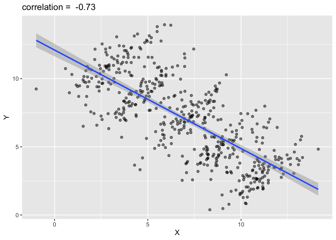
See? When we visualize our data, sometimes the patterns reveal themselves. What you see in numbers may sometimes be very misleading.
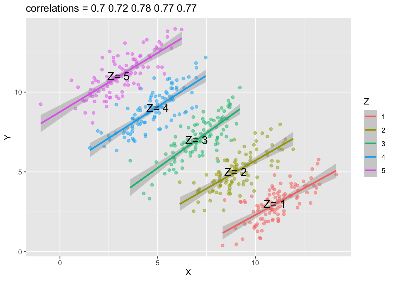
Simpson’s Paradox
Another example is Simpson’s Paradox, which refers to a statistical phenomenon where an association between two variables in a population emerges, disappears or reverses when the population is divided into sub-groups.
For example, the following graph shows the association/correlation between x and y for the entire population.

Based on the above graph, you would probably conclude that when x increases, y decreases. That is, the correlation analysis suggests a negative relationship between x and y when the entire population is analyzed as a whole.
However, if we plot the scatter plots by groups (i.e., a Z grouping factor), you may get the opposite conclusions. All correlations between x and y in each sub-group are now positive.
That is, the association you observe in the population now is reversed in each sub-group.
7.2 ggplot2
R is famous for its power in data visualization. In this chapter, I will introduce you a very powerful graphic library in R, ggplot2.
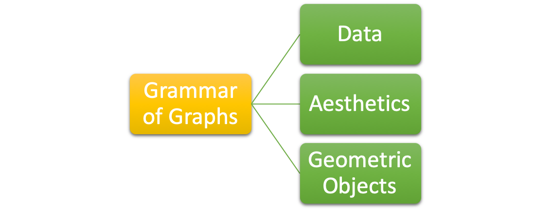
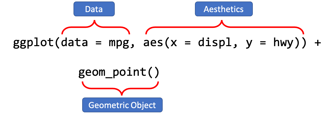
For any data visualization, there are three basic elements:
- Data: The raw material of your visualization, i.e., a data frame.
- Aesthetics: The mapping of your data to aesthetic attributes, such as
x,y,color,size,linetype,fill. - Geometric Objects: The layers of geometric objects you would like to include on the plots, e.g., lines, points, bars, boxplots, etc.
I will demonstrate some basic functions of ggplot2, with the pre-loaded dataset mpg:
To begin with data visualization, it is crucial to have a clear understanding of the dataset. This includes comprehending the definitions of the rows and columns in the data. For instance, in the dataset named mpg, every row pertains to a specific vehicle, while the columns comprise the following information:
model: manufacturer model namedispl: engine displacement, in litres (排氣量)hwy: highway miles per galloncty: city miles per galloncyl: number of cylinders (汽缸數目)class: car typedrv: the type of drive train, where f = front-wheel drive (前輪驅動), r = rear wheel drive (後輪驅動), 4 = 4wd (四輪傳動)
There are two very useful functions for exploration of a data frame: str() and summary().
tibble [234 × 11] (S3: tbl_df/tbl/data.frame)
 $ manufacturer: chr [1:234] "audi" "audi" "audi" "audi" ...
 $ model       : chr [1:234] "a4" "a4" "a4" "a4" ...
 $ displ       : num [1:234] 1.8 1.8 2 2 2.8 2.8 3.1 1.8 1.8 2 ...
 $ year        : int [1:234] 1999 1999 2008 2008 1999 1999 2008 1999 1999 2008 ...
 $ cyl         : int [1:234] 4 4 4 4 6 6 6 4 4 4 ...
 $ trans       : chr [1:234] "auto(l5)" "manual(m5)" "manual(m6)" "auto(av)" ...
 $ drv         : chr [1:234] "f" "f" "f" "f" ...
 $ cty         : int [1:234] 18 21 20 21 16 18 18 18 16 20 ...
 $ hwy         : int [1:234] 29 29 31 30 26 26 27 26 25 28 ...
 $ fl          : chr [1:234] "p" "p" "p" "p" ...
$ class : chr [1:234] "compact" "compact" "compact" "compact" ... manufacturer model displ year
Length:234 Length:234 Min. :1.600 Min. :1999
Class :character Class :character 1st Qu.:2.400 1st Qu.:1999
Mode :character Mode :character Median :3.300 Median :2004
Mean :3.472 Mean :2004
3rd Qu.:4.600 3rd Qu.:2008
Max. :7.000 Max. :2008
cyl trans drv cty
Min. :4.000 Length:234 Length:234 Min. : 9.00
1st Qu.:4.000 Class :character Class :character 1st Qu.:14.00
Median :6.000 Mode :character Mode :character Median :17.00
Mean :5.889 Mean :16.86
3rd Qu.:8.000 3rd Qu.:19.00
Max. :8.000 Max. :35.00
hwy fl class
Min. :12.00 Length:234 Length:234
1st Qu.:18.00 Class :character Class :character
Median :24.00 Mode :character Mode :character
Mean :23.44
3rd Qu.:27.00
Max. :44.00 To begin with, I like to use one simple example to show you how we can create a plot using ggplot2.
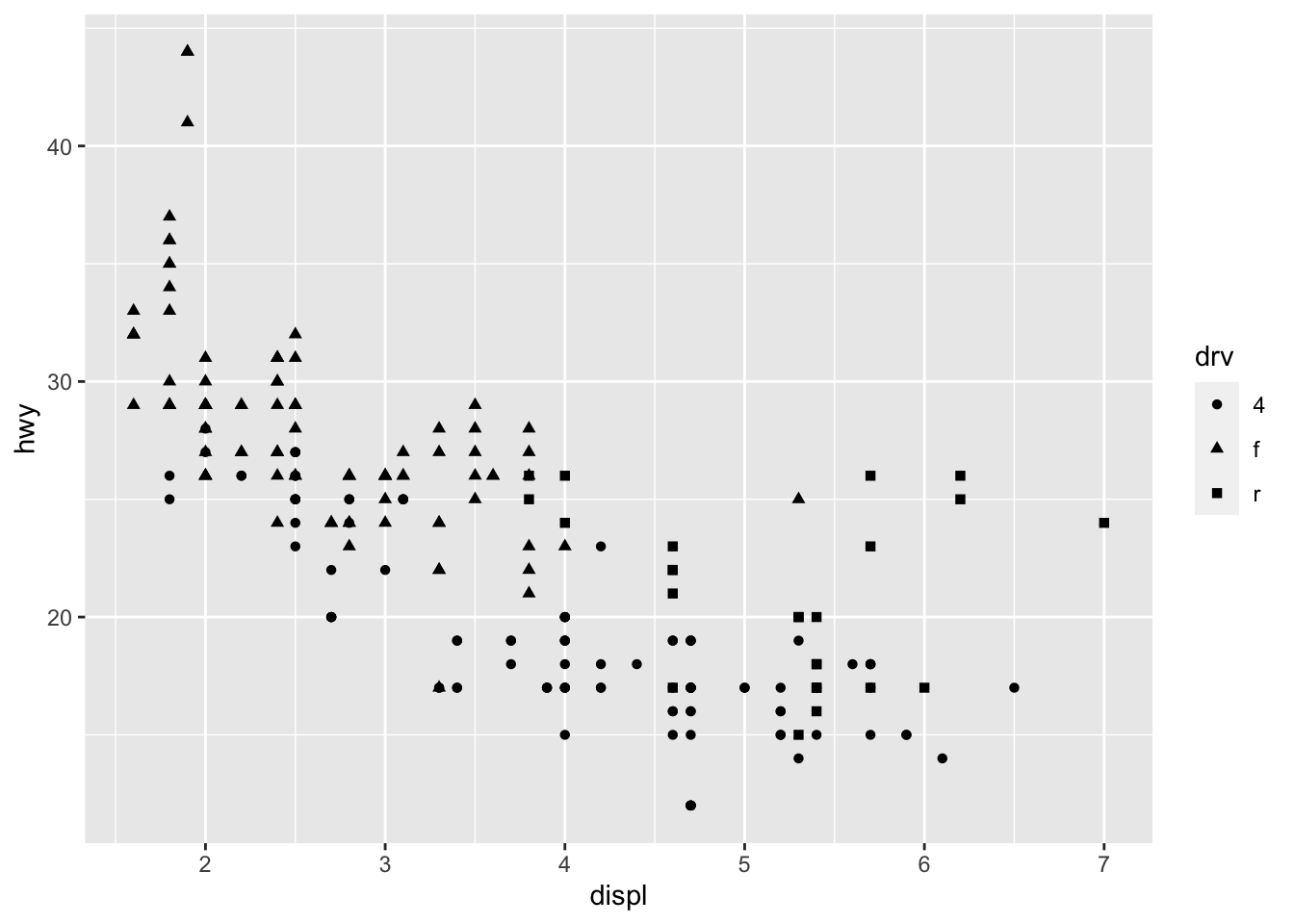
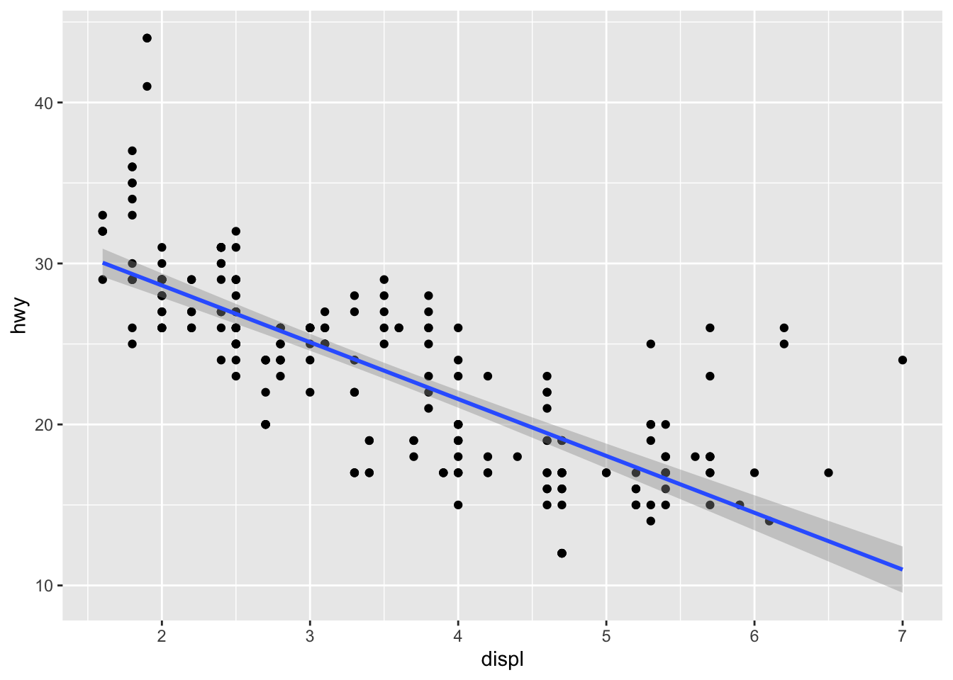
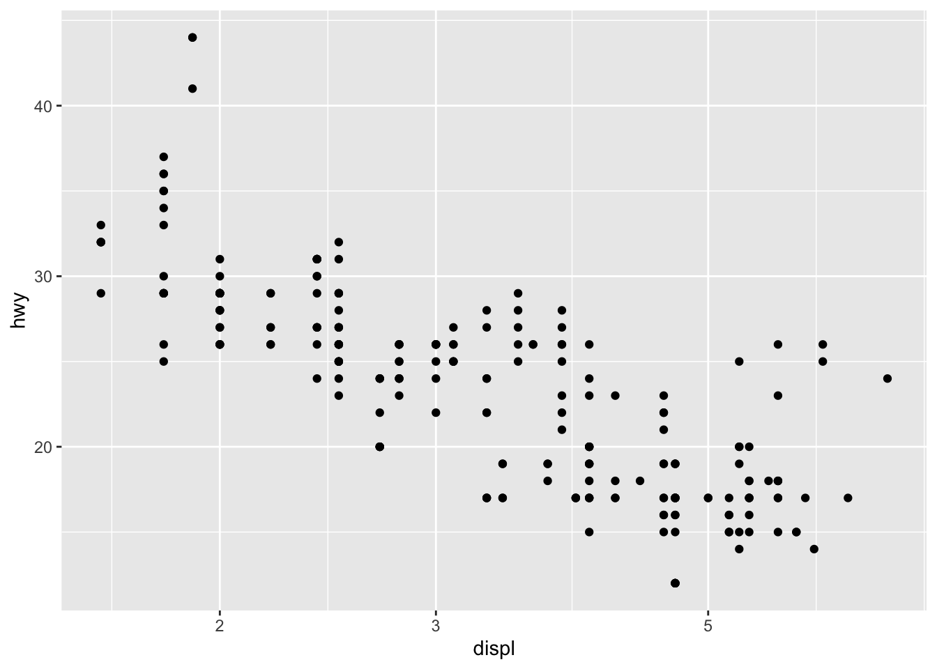
With the dataset mpg, we can look at the relationship between displ and hwy: whether the engine displacement has to do with the car miles per gallon. We can draw a scatter plot as shown below.
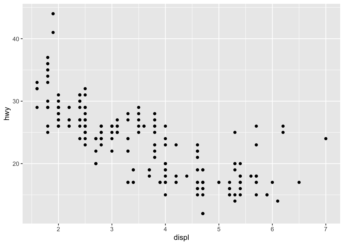
A ggplot object often includes lat least three important components:
ggplot()initializes the basic frame of the graph, withdata = mpgspecifying the data frame on which the plot is builtaes()further specifies the mapping of axises and the factors in the data frame.aes(x = displ, y = hwy)indicates thatdisplis mapped as thexaxis andhwyasyaxis+means that you want to add one layer of the graph to the template.geom_point()means that you want to add a layer of point graph.
7.3 Variables and Data Type
When creating the graphs for your data, you need to know very well the data type of all the variables to be included in the graph. There are at least three important data types you need to know:
- Categorical variables: these variables usually have only limited set of discrete values, i.e., levels. They are usually coded as
charactervector orfactorin R. - Numeric variables: these variables are continuous numeric values. They are usually coded as
numericvector. - Date-Time variables: these variables, although being numeric sometimes, refer to calendar dates or times. They are usually coded as
Date-TimeClassesin R.
The general principle in data visualization is that always pay attention to the data type for variables on the x-axis and y-axis.
7.4 One-variable Graph
If your graph includes only one variable from the data, usually this would indicate that you are interested in the distribution of the variable.
When creating a one-variable plot using ggplot2, R must first determine how to represent the data, depending on whether the variable is continuous or categorical. The process involves converting the raw data into a format suitable for visualization.
- For continuous variables, the data is binned (for histograms) or smoothed (for density plots).
- For categorical variables, the data is counted, and the counts are plotted.
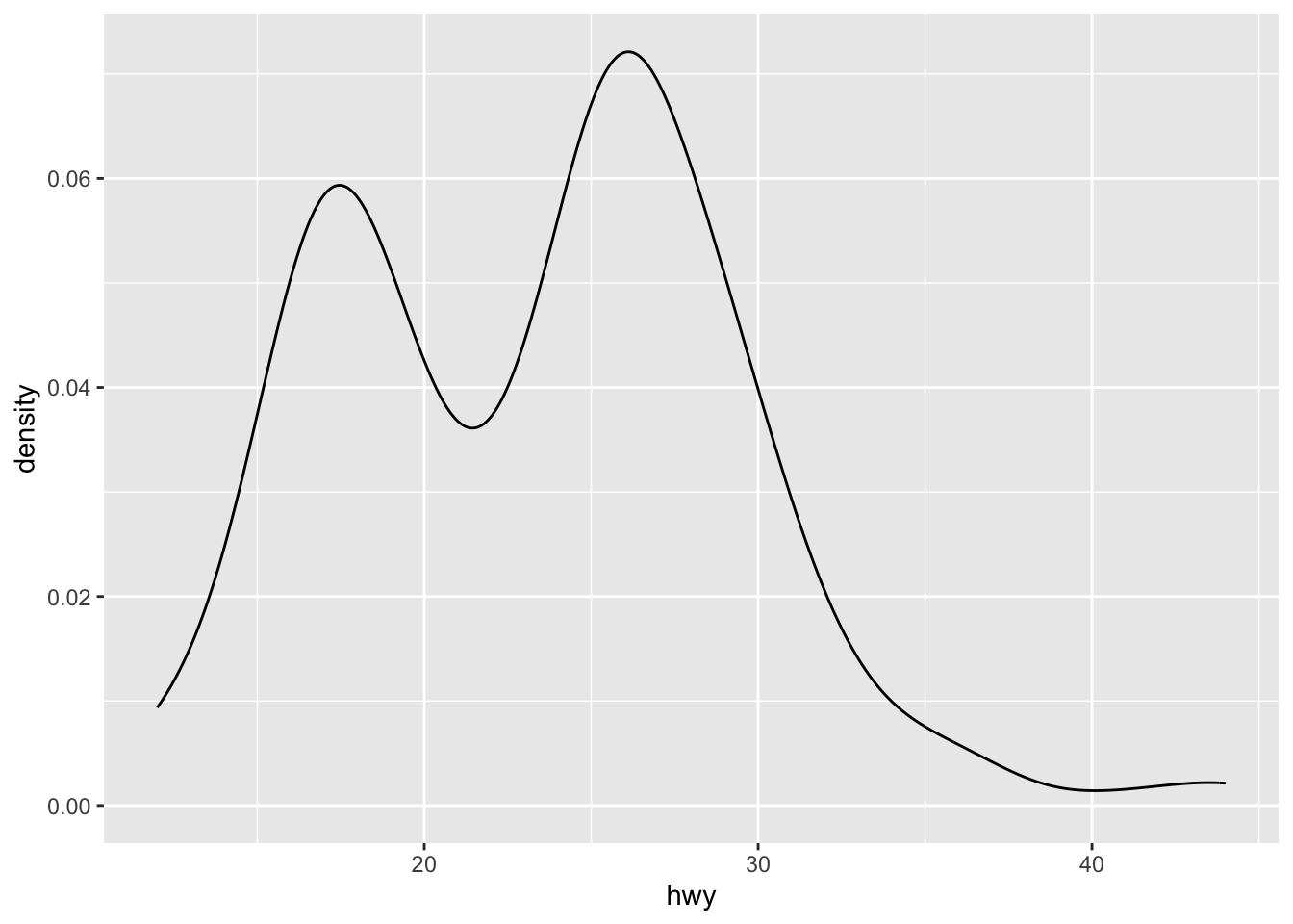
7.4.1 Continuous Variable
- Histogram
- Density plot
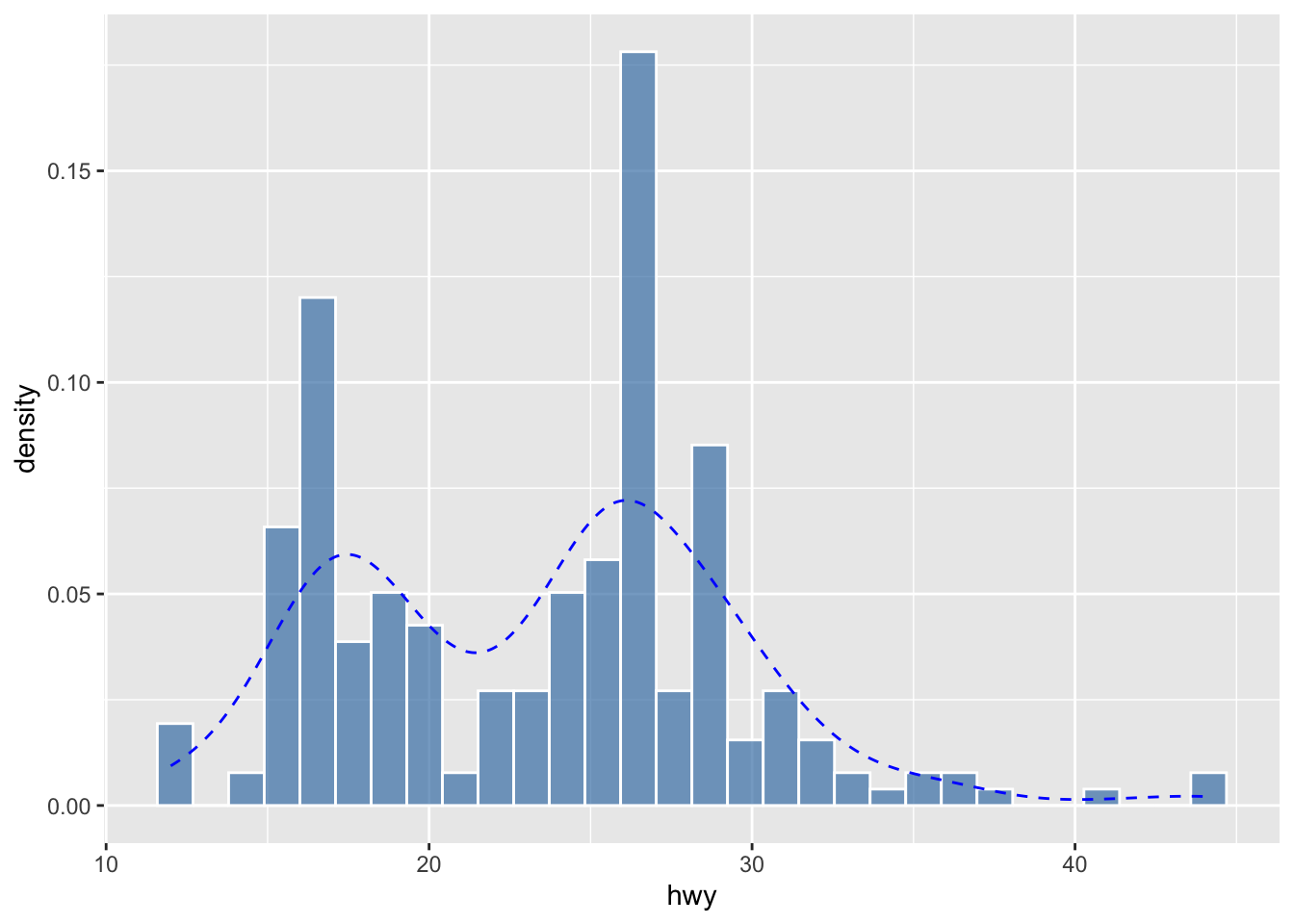
We can also combine the histogram and density plots into one:
Any thoughts about how to do that?
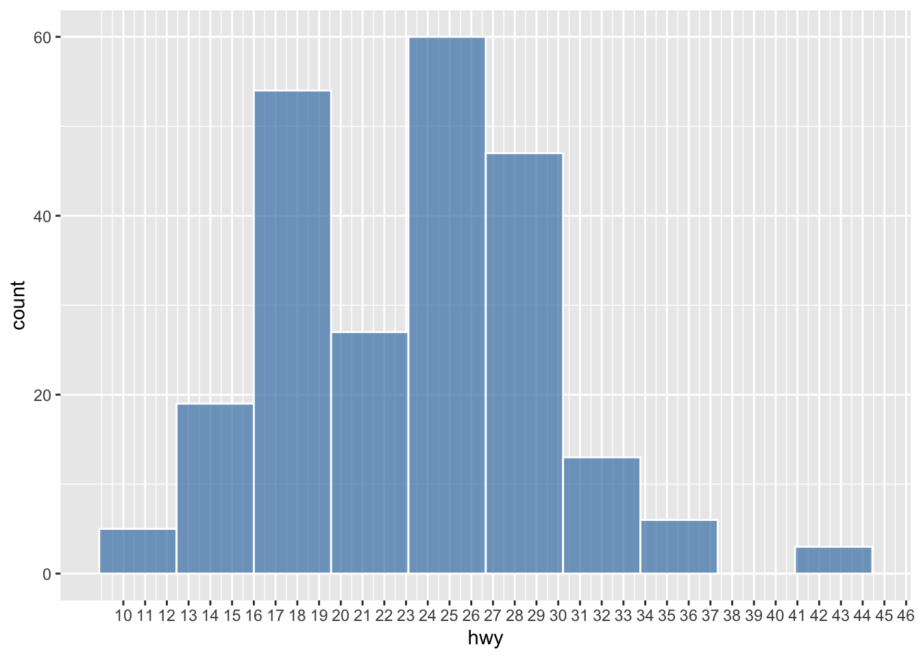
The way we examine the distribution of the continuous variable (i.e., numbers) is to divide the entire range of values into a series of intervals, i.e., bins, and then count how many values in the data set fall into each interval.
In other words, the shape of your histogram may vary depending on two parameters:
- Number of bins: the number of intervals you have
- Bin width: the size of each interval
Changes of either of the parameters would lead to a histogram of a different shape.
ggplot(data = mpg, aes(hwy)) +
geom_histogram(
color = 'white',
fill = 'steelblue',
alpha = 0.7,
bins = 10
) +
scale_x_continuous(breaks = seq(10, 46, 1))
ggplot(data = mpg, aes(hwy)) +
geom_histogram(
color = 'white',
fill = 'steelblue',
alpha = 0.7,
binwidth = 2
) +
scale_x_continuous(breaks = seq(10, 46, 1))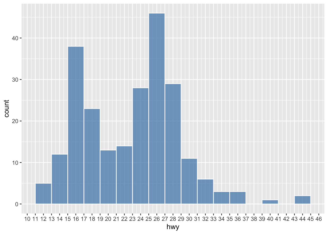
## You can check the min or max of each bin
g <- ggplot(data = mpg, aes(hwy)) +
geom_histogram(color = "white")
## Auto-print the ggplot
g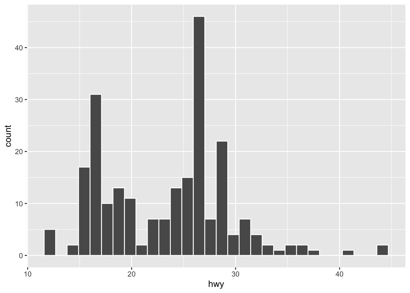
[1] 11.58621 12.68966 13.79310 14.89655 16.00000 17.10345 18.20690 19.31034
[9] 20.41379 21.51724 22.62069 23.72414 24.82759 25.93103 27.03448 28.13793
[17] 29.24138 30.34483 31.44828 32.55172 33.65517 34.75862 35.86207 36.96552
[25] 38.06897 39.17241 40.27586 41.37931 42.48276 43.58621 [1] 12.68966 13.79310 14.89655 16.00000 17.10345 18.20690 19.31034 20.41379
[9] 21.51724 22.62069 23.72414 24.82759 25.93103 27.03448 28.13793 29.24138
[17] 30.34483 31.44828 32.55172 33.65517 34.75862 35.86207 36.96552 38.06897
[25] 39.17241 40.27586 41.37931 42.48276 43.58621 44.689667.4.2 Categorical Variable
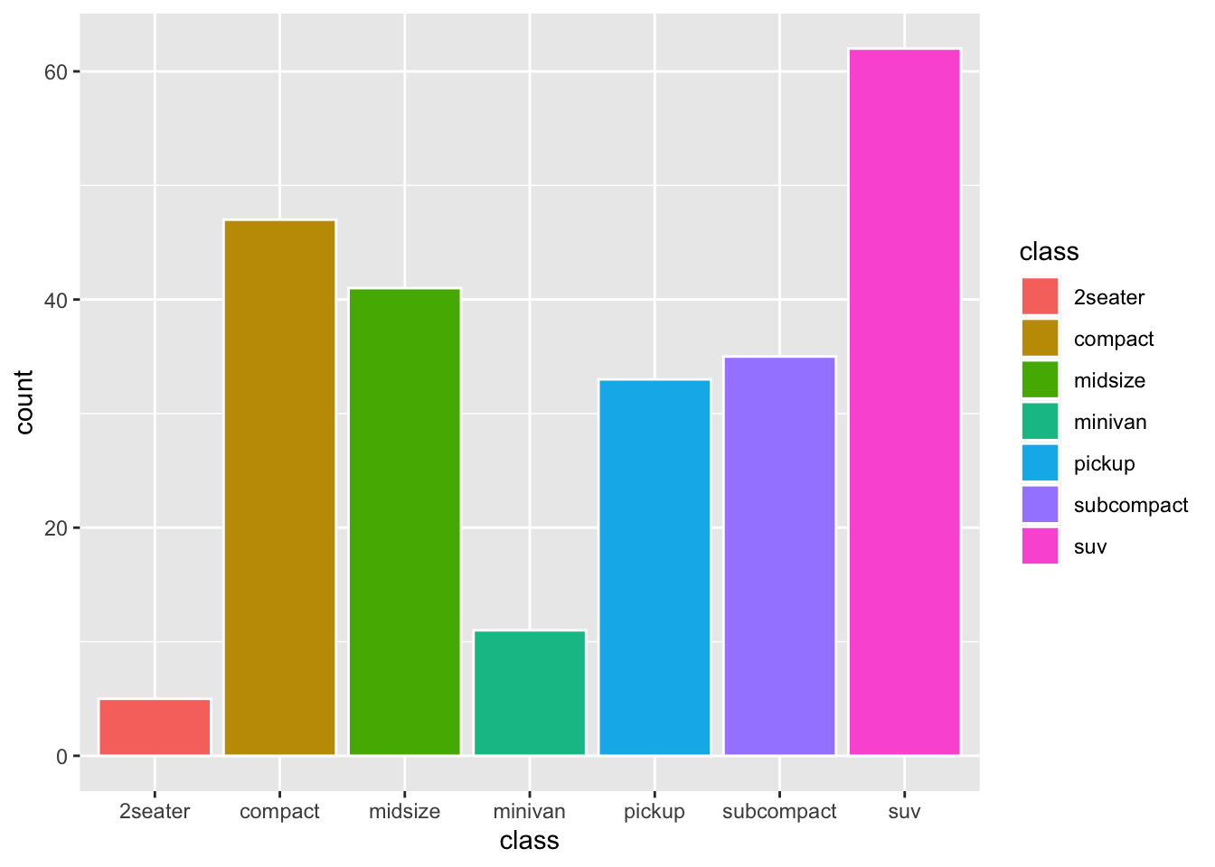
- Bar plot

When creating the bar plot, we can also use the normalized frequencies of each category, instead of the raw frequency counts. Any idea?
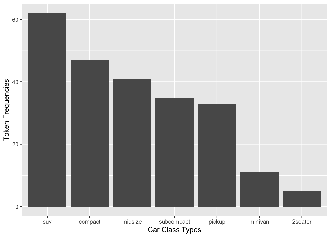
Exercise 7.1 How can we create a bar plot as above but with the bars arranged according to the counts in a descending order from left to right? (see below)
Hint: check reorder()

7.5 Two-variable Graph
If your graph includes two variables, then very likely one variable would go to the x-axis and the other, y-axis. Depending on their data types (categorical or numeric), you may need to create different types of graphs.
7.5.1 Continuous X, Continuous Y
- Scatter Plot

We can add a regression line to the scatter plot:
ggplot(data = mpg, aes(x = displ, y = hwy)) +
geom_point() +
geom_smooth(method='lm', formula= y~x, color = "blue") +
geom_smooth(method = 'loess', color = "red") # LOWESS smooth line
The LOWESS line is a non-parametric smoother that can capture more complex patterns in the data than the linear regression line.
7.5.2 Categorical X, Continuous Y
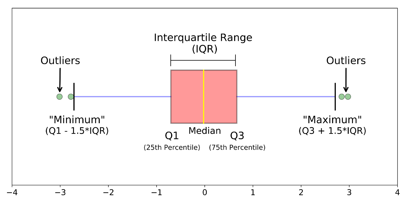
Boxplot: A boxplot provides a visual summary of the distribution of the values (
Y) across the levels of the grouping factor (X), showing each sub-group’s central tendency, spread, skewness, and potential outliers.- Median (Line Inside the Box): The horizontal line inside the box represents the median (50th percentile), showing the dataset’s central value.
- Box (Interquartile Range, IQR): The box spans from the first quartile (Q1, 25th percentile) to the third quartile (Q3, 75th percentile). The length of the box is the IQR, which indicates the spread of the middle 50% of the data.
- Whiskers: The lines extending from the box (whiskers) indicate variability outside the upper and lower quartiles. Typically, the whiskers extend to the smallest and largest data points within 1.5 times the IQR from Q1 and Q3.
- Outliers (Points Outside the Whiskers): Data points outside the whiskers are considered outliers and are plotted as individual points.
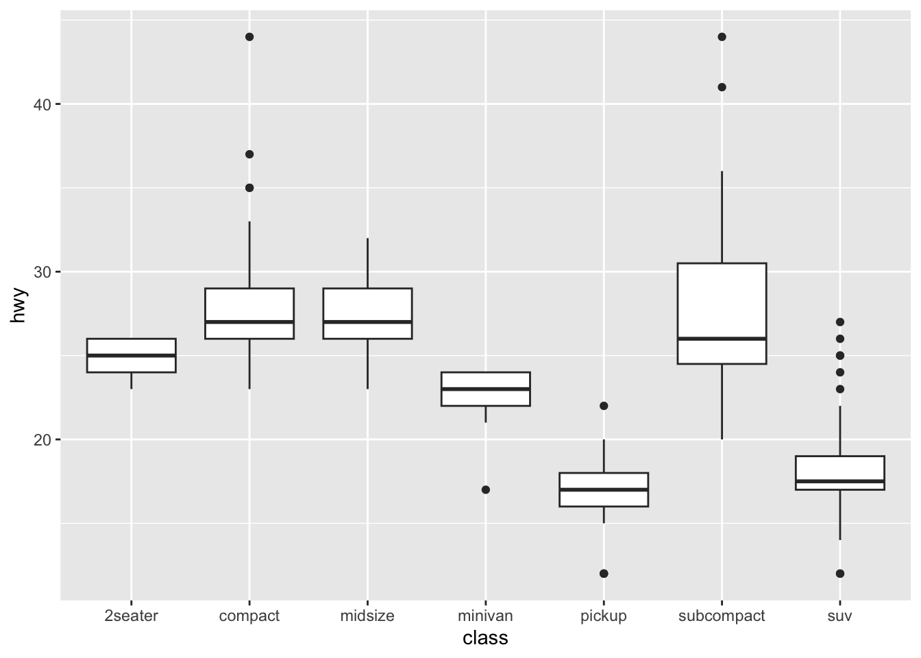
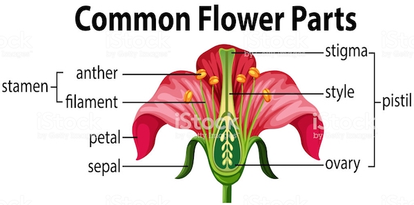
If you would like to know more about boxplots, please check this blog post. The following illustration is based on the blog post, which shows the meanings of different boxplot parts.
Error Plot: An error plot (often error bars) shows the uncertainty or variability of each sub-group’s mean value. Error plots help assess the reliability of the central value and compare variability across groups.
- Central Point/Bar: Represents the central value (e.g., subgroup’s mean).
- Error Bars (Vertical or Horizontal Lines): Extend from the central point and indicate the range of uncertainty, typically showing confidence intervals or standard errors. The length of the bars shows the extent of variability around the central value.
- Shorter bars suggest more precise estimates (less variability).
- Longer bars suggest higher uncertainty or variability.
## pointrange
ggplot(data = mpg, aes(x = class, y = hwy)) +
stat_summary(fun.data = mean_cl_boot, geom = "pointrange")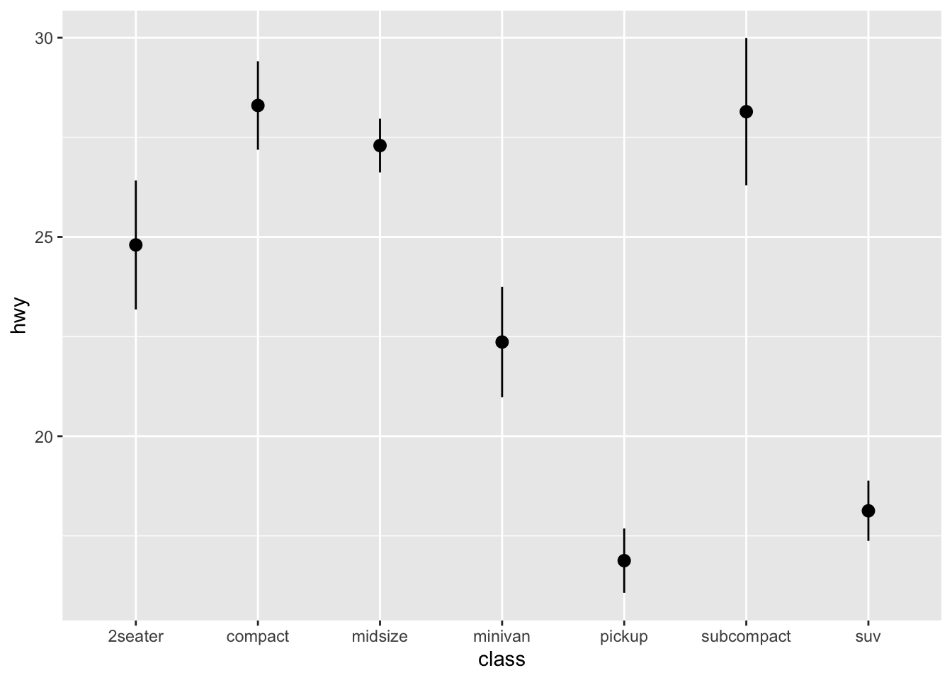
## errorbar
ggplot(data = mpg, aes(x = class, y = hwy)) +
stat_summary(fun = mean, geom = "point", size = 3) +
stat_summary(fun.data = mean_cl_boot, geom = "errorbar", width = 0.2)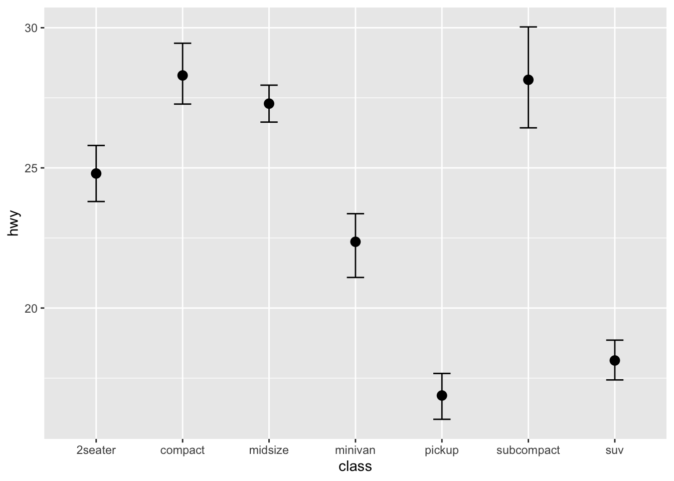
Sometimes, people may present their error plots as shown below, with bars representing the mean values of each group. Any idea how to do this?

The functions, mean_cl_normal() and mean_cl_boot() are two wrappers around functions from Hmisc library.
- The
mean_cl_normal()computes the mean and the confidence limits based on a t-distribution. - The
mean_cl_bootwould produce a less assumption laden bootstrapped confidence interval.
ggplot(data = mpg, aes(x = class, y = hwy)) +
stat_summary(fun.data = mean_cl_normal, geom = "pointrange")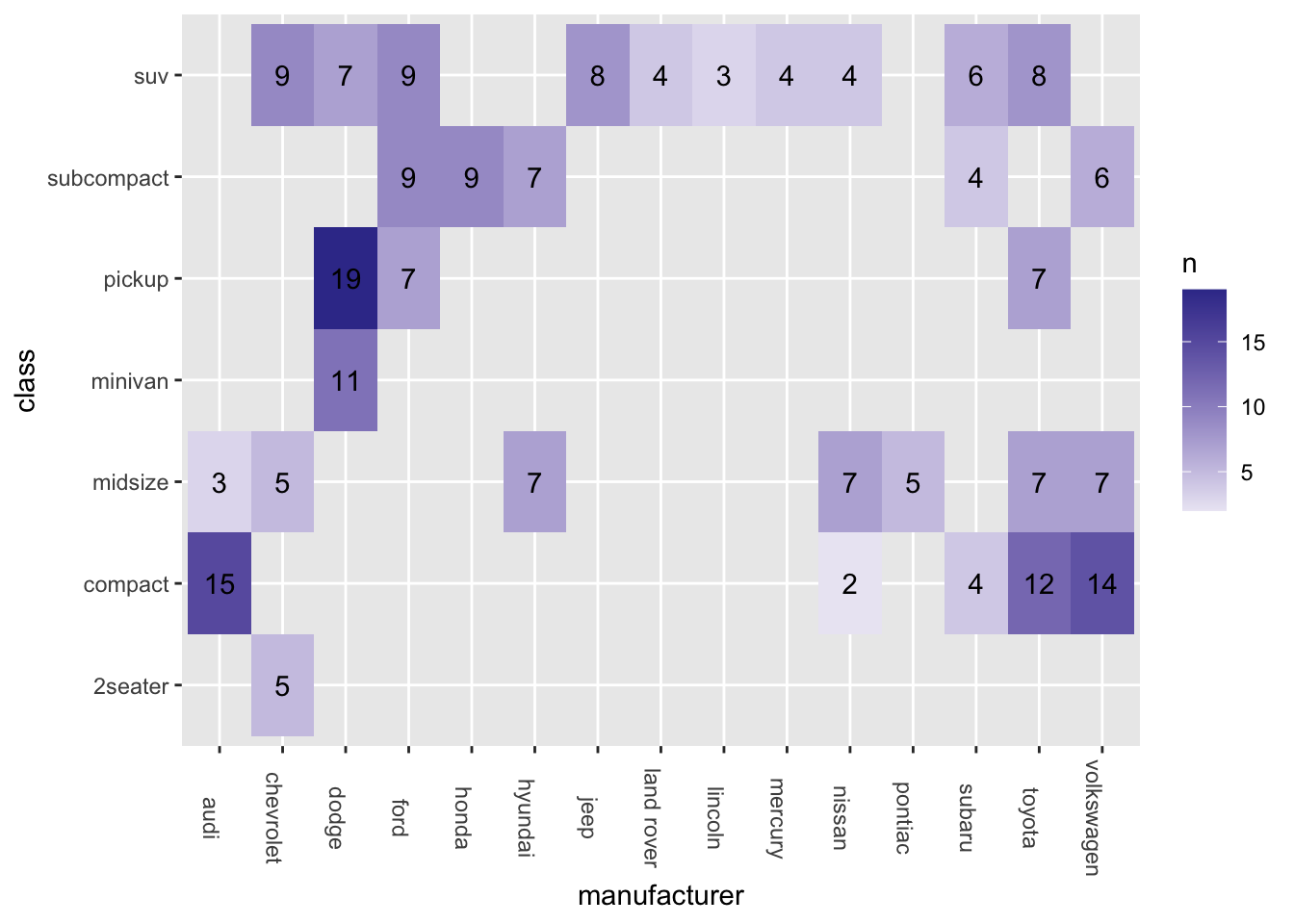
If you run into problems plotting the error plot using stat_summary(), probably you did not have the necessary packages installed in your current R environment. Please make sure that you have installed the package tidyverse or ggplot2 properly without any error messages in the process of installation.
Also, if you run into an error here, please try to install the tidyverse from source again. (For the other relevant packages, it is ok to install those packages in a normal way from CRAN). For more detail, please refer back to Chapter 2.10.
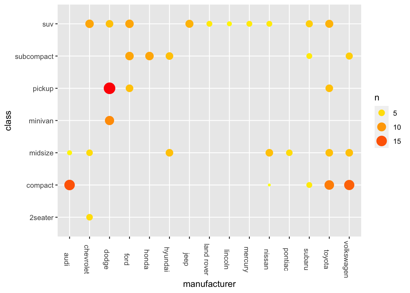
7.5.3 Categorical X, Categorical Y
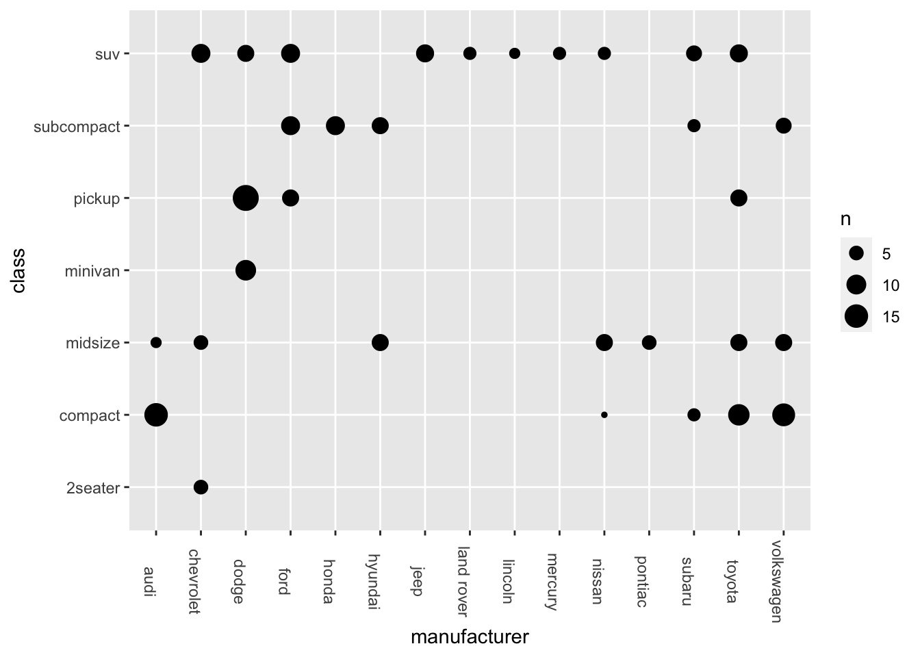
- Bubble Plot
ggplot(data = mpg, aes(x = manufacturer, y = class)) +
geom_count() +
theme(axis.text.x = element_text(angle=-90))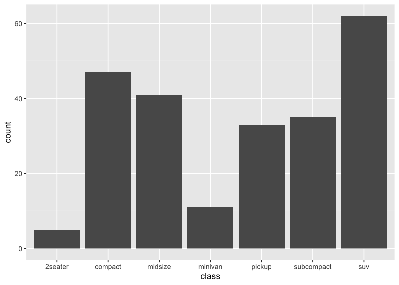
Exercise 7.2 Another option is to create a Heatmap, as shown below:
ggplot(data = mpg, aes(x = manufacturer, y = class)) +
geom_tile() +
theme(axis.text.x = element_text(angle=-90))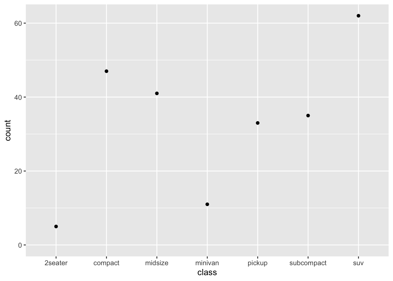
However, the heatmap above is not very informative because each tile is the same color, failing to convey the varying frequency counts for each combination of levels.
Please create a more comprehensive heatmap as demonstrated below.
To achieve this, you will need the frequency counts for each combination of levels. In addition, include these frequency counts as labels on the heatmap.
Hint: geom_tile(); geom_text()
7.6 stat function
Previously, we used the stat_summary() function to create an error plot. Now let’s explore other stat_*() functions available in ggplot2.
When plotting data, sometimes we supply values directly for the aesthetic mapping (i.e., y values). However, other times, the values are derived from the data through specific transformations or computations. In ggplot2, some geom functions automatically perform data transformations before creating the plot, such as:
geom_bar(): computes the frequency counts for the levels of xgeom_smooth(): computes the best fit of the datageom_boxplot(): computes the necessary statistics for the boxplots.
In addition, ggplot2 provides several statistics transformation functions, which take the form of stat_*(). These functions usually:
- Compute the transformed values based on the original y values in the aesthetic mapping.
- Create a geom layer that corresponds to the transformed values.
- Each
stat_*()function has its own default geom object, just as eachgeom_*()function has its own default statistics transformation.
To access the computed/transformed values produced by stat_<compute variable>(), we can use the following two methods: after_stat(<compute variable> or ..<computed variable>... (Note: The latter representation has been deprecated!)
You can check the function documentation for all the computed variables produced by the stat_*() function.
The following code demonstrates how to use stat_count() to compute frequency counts and then a bar plot:


We can change the default geom in stat_count(), as shown below.
## We can change the default geom in stat_count()
ggplot(data = mpg, aes(x = class)) +
stat_count(geom = "point")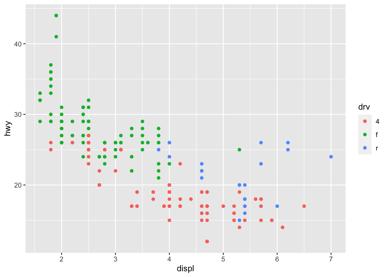
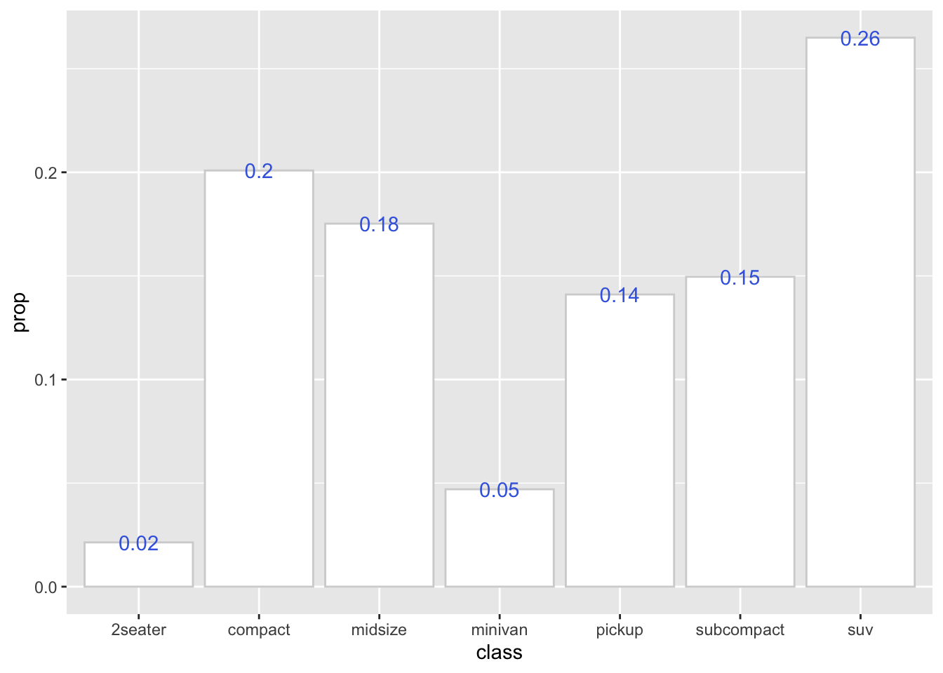
So we can make use of the computed variable (e.g., after_stat(count), after_stat(prop)) from stat_count() to create more advanced graphs:
ggplot(data = mpg, aes(x = class)) +
stat_count(
aes(y = after_stat(prop),
group =1),
geom="bar",
fill="white",
color="lightgrey"
) +
stat_count(
aes(y = after_stat(prop),
label = round(after_stat(prop),2),
group =1),
geom= "text",
color = "royalblue"
) 
This code snippet creates a bar plot with text labels using the computed prop variable.
The prop in stat_count() is defined as the groupwise proportion, which means that it is computed based on the number of observations in each group. By default, the group parameter is set to x. This means that stat_count will calculate the proportion of different x values in different x groups. The final result will be either 1 or 0, which cannot be seen in the plot.
If you want to calculate the prop in the entire dataset, you can set the group parameter to 1 to ensure that the proportion (%) is calculated based on the entire dataset (as one group) rather than just a subset of the data.
7.7 More Aesthetic Features
There are three main ways to map an additional variable to an aesthetic feature:
- Uniform mapping: A single aesthetic value is applied to the entire dataset, outside of
aes(). - Subject-based mapping: Each subject is assigned a unique aesthetic value, typically based on a continuous variable inside
aes(). - Group-based mapping: Subjects within the same group share the same aesthetic value, typically based on a categorical factor inside
aes().
7.7.1 color
Now I would like to demonstrate how we can add additional aesthetic mappings to your graphs.
Earlier we create a scatter plot using the following code:
The above plot includes two variables into the graph, x = displ and y = hwy.
The additional aesthetic features may include things like colors, sizes, shapes, line-types, widths etc. The idea is that we can introduce a third variable into the plot by mapping the variable to one of these aesthetic features, i.e., modifying these aesthetic attributes based on the value of that third variable.
- For example, you can add
color = ...in theaes(x = ..., y = ..., color = ...)to create the graphs on the basis of another grouping factor.
In the above example, color is an aesthetics (put in the aes()).
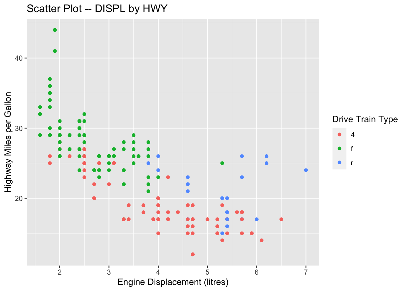
This would suggest that the color of each point is now mapped to the variable drv. In this case, points belonging to different groups of drv would be of different colors—different drive train types have different colors in points.
Note that the x-coordinates and y-coordinates are aesthetics too, and they are mapped to the displ and hwy variables, respectively. Now we enrich the graph by further mapping the color to the third variable drv, which indicates whether a car is front wheel drive, rear wheel drive, or 4-wheel drive.
If you would like to know more about the color names available in R, I would highly recommend this R Color Cheat Sheet.
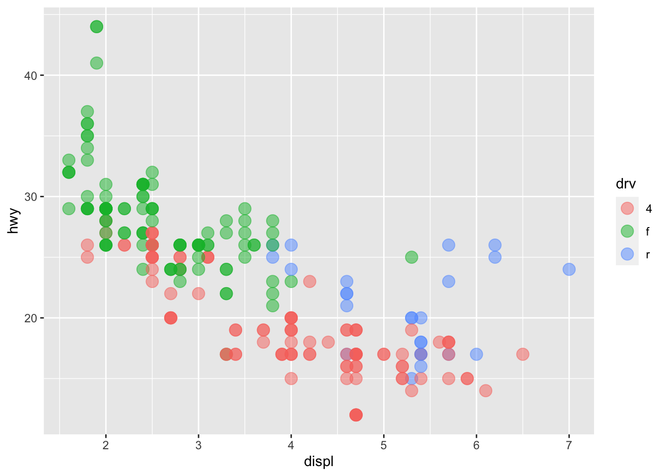
Exercise 7.3 When creating a graph, the aesthetic feature color can also be specified within the geom_*() as well.
Please compare the following two ways of color specification and describe their respective functional differences.

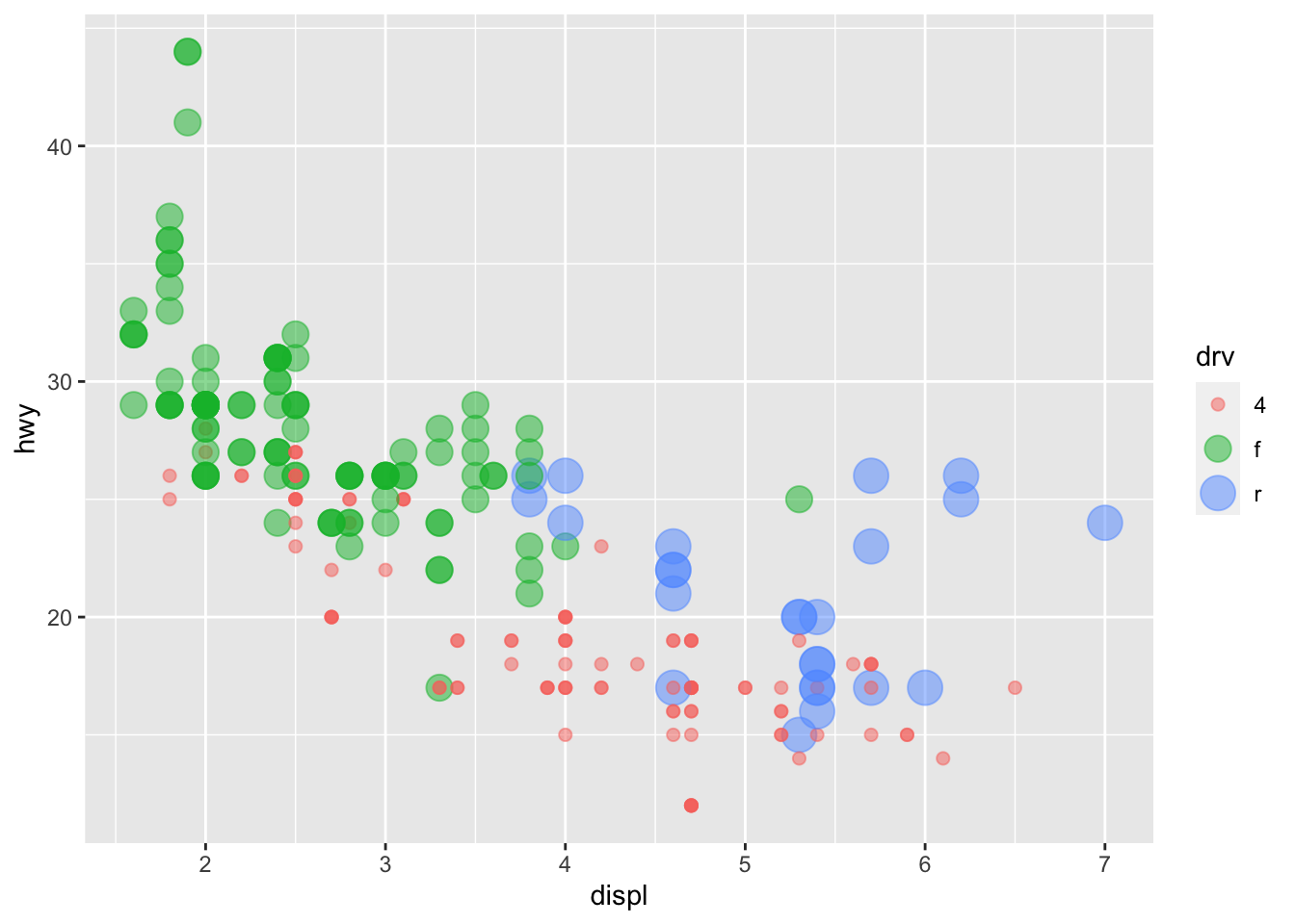
7.7.3 size
We can also map a grouping factor to the aesthetic feature size. That is, different groups will be represented by geometric objects of varying sizes.

7.7.4 fill
For bar plots or histograms, we can fill the bars with different colors by adding fill = ... in the aes().
ggplot(data = mpg, aes(x = class, y = hwy, fill = class)) +
geom_boxplot(color = 'black',
size = 0.2,
notch = TRUE)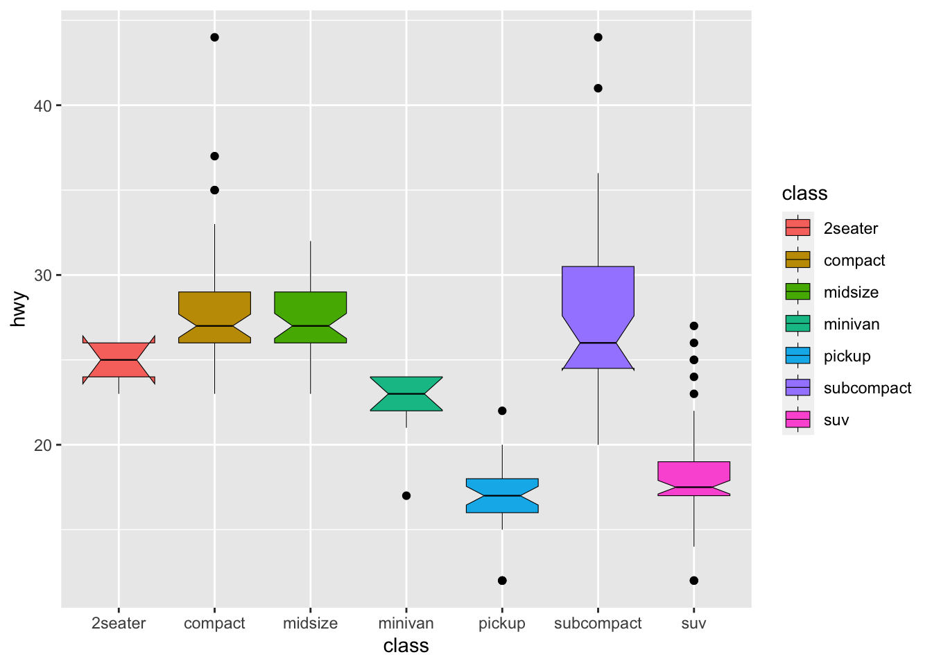
In ggplot2, both color and fill are two aesthetic mappings that can be used to distinguish between groups in a plot.
color changes the outline color of a graphical element, while fill changes the interior fill color or pattern of a graphical element.
7.7.5 shape
We can map a third variable to the graph using shape as well.
And of course you can map both shape and color to the same third variable:
Exercise 7.4 In Section 7.5, we talked about how to create a bubble plot.
ggplot(data = mpg, aes(x = manufacturer, y = class)) +
geom_count() +
theme(axis.text.x = element_text(angle=-90))
Please adjust the codes to create a similar bubble plot with not only the sizes but also the colors of the bubbles indicating the varying token numbers in each level combination.
7.8 More Layers
7.8.1 geom_... Layers
The ggplot object consists of layers of geometric objects. We can also add another geom_*() object, such as a smooth line by using the +:
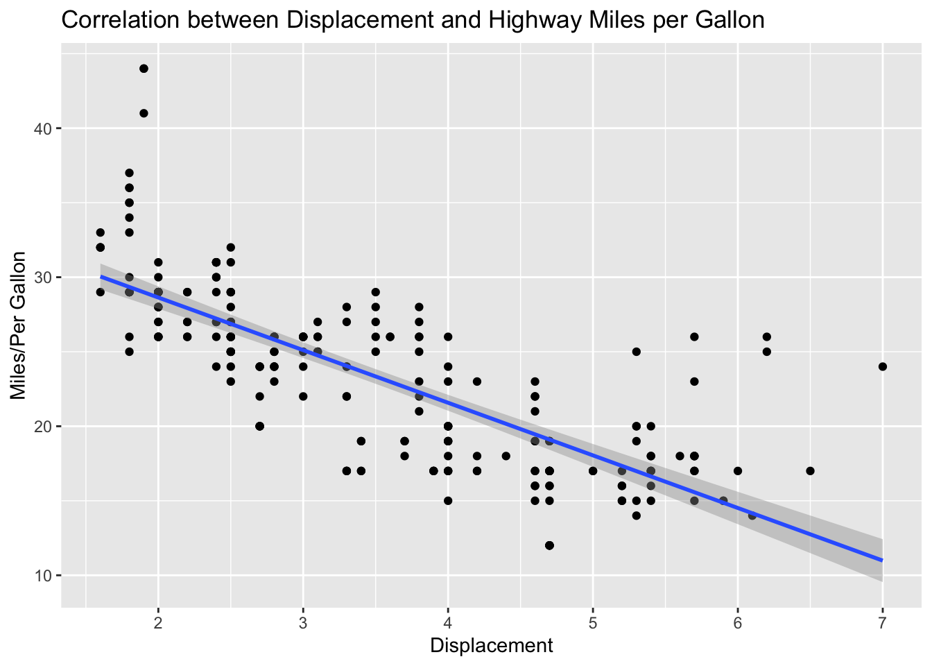
7.8.2 Labels and Annotations
We can add self-defined labels of the x and y axes and main/sub titles to the graphs using labs(). (By default, ggplot2 will utilize the original variable names [i.e., column names] for x and y labels.)
ggplot(data = mpg, aes(x = displ, y = hwy)) +
geom_point() +
geom_smooth(method = 'lm') +
labs(title = "Correlation between Displacement and Highway Miles per Gallon",
x = "Displacement",
y = "Miles/Per Gallon")
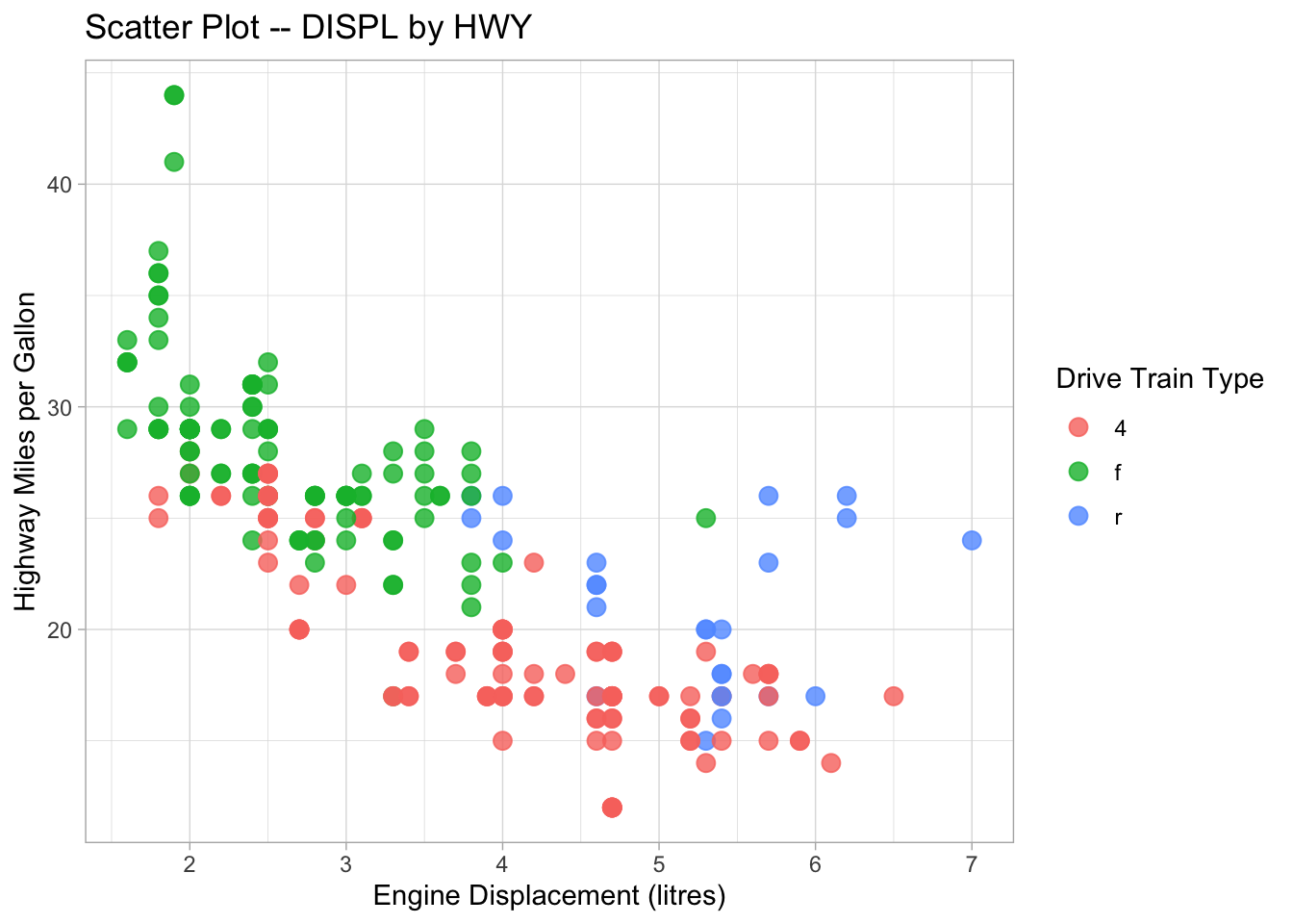
ggplot(data = mpg,
       aes(x = displ, y = hwy, color = drv)) +
geom_point() +
labs(x = "Engine Displacement (litres)",
y = "Highway Miles per Gallon",
title = "Scatter Plot -- DISPL by HWY",
color = "Drive Train Type")
7.8.3 Facets
Sometimes we may want to create plots based on a conditional factor. For example, we can check the relationship between city milage (cty) and highway milage (hwy) for cars by different manufacturers (class).
ggplot(data = mpg, aes(x = cty, y = hwy)) +
  geom_point() +
  geom_smooth(method = "lm") +
  facet_wrap(vars(class))
Please check facet_grid() on your own.
7.8.4 Themes
We can easily change the aesthetic themes of the ggplot by adding one layer of theme_*().
## Save the ggplot2 object
graph1 <- ggplot(data = mpg, aes(x = displ, y = hwy, color = drv)) +
  geom_point(size = 3, alpha = .8) +
  labs(
    x = "Engine Displacement (litres)",
    y = "Highway Miles per Gallon",
    title = "Scatter Plot -- DISPL by HWY",
    color = "Drive Train Type"
  )

## autoprint the graph
graph1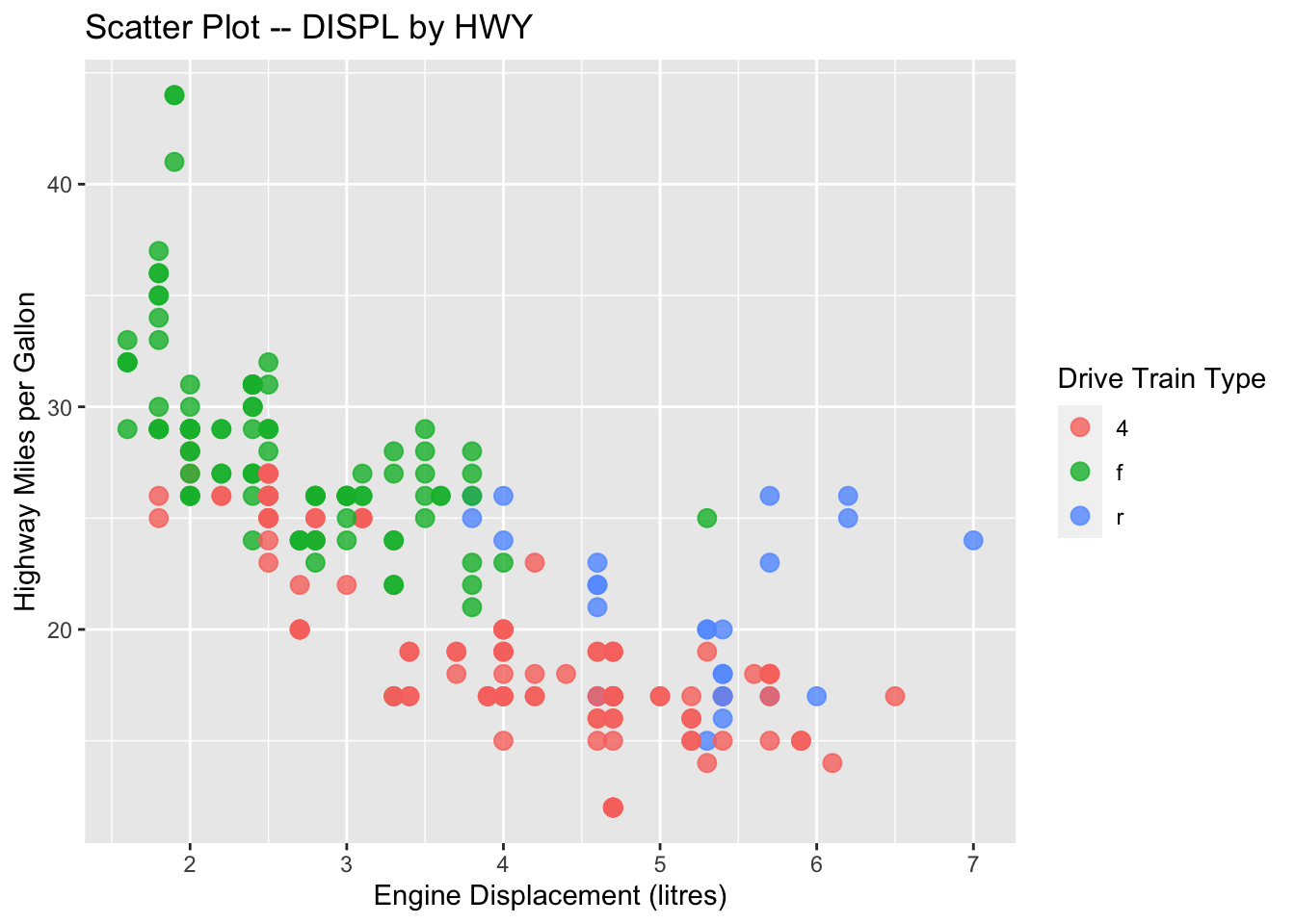
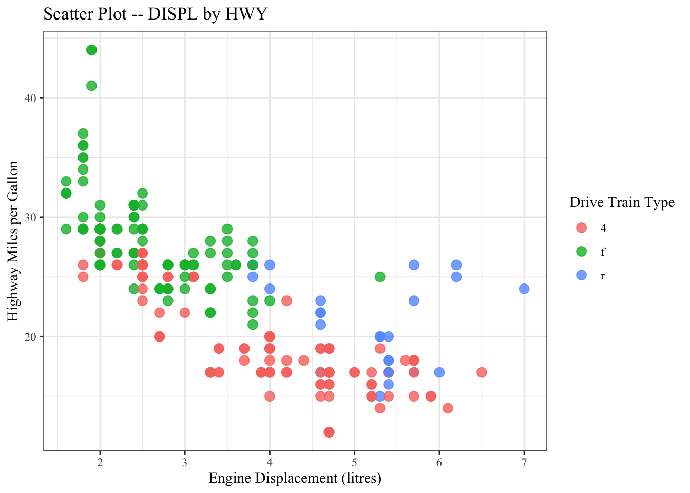

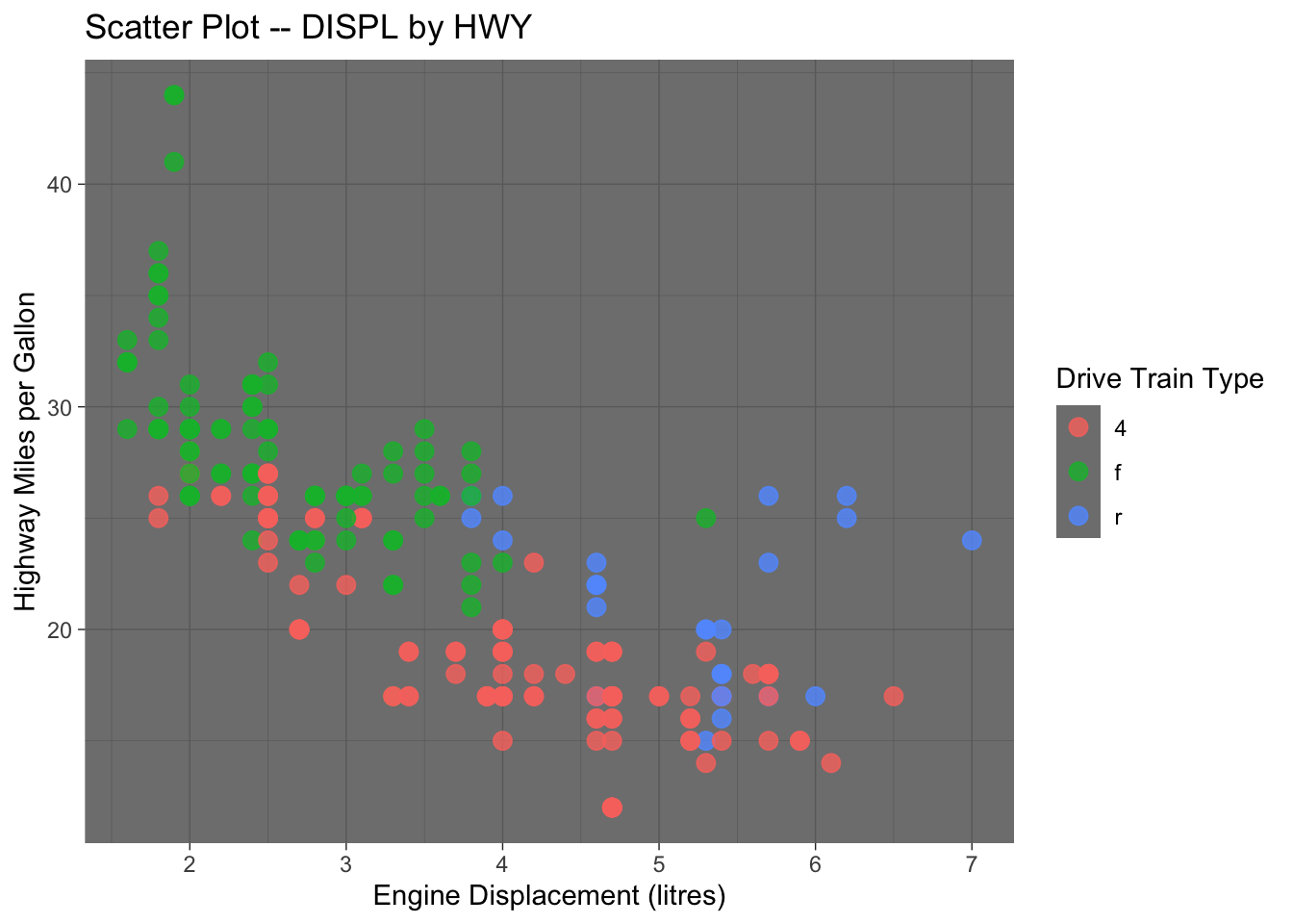
In addition the the default theme template provided in ggplot2, you can check ggthemes library for more fancy predefined themes available for your data visualization.
7.8.5 Advanced Customization of the Aesthetic Features (Self-study)
In ggplot2, the scale_*_*() family of functions controls the mapping of data to aesthetic properties like color, size, and position. These functions allow you to customize the appearance of a plot by modifying the scales associated with each aesthetic.
The scale_*_*() functions follow the pattern scale_<aesthetic>_<transform>(), where:
<aesthetic>is an aesthetic property (e.g.,x,y,color,size).<transform>is the type of transformation or scale (e.g.,continuous,discrete,log10,sqrt).
Here are some common functions and their applications:
Continuous scales:
scale_x_continuous(): Modifies the x-axis scale for continuous data.scale_y_continuous(): Modifies the y-axis scale for continuous data.- You can adjust limits, breaks, labels, and more.
   ggplot(mpg, aes(x = displ, y = hwy)) +
     geom_point() +
     scale_x_continuous(limits = c(2, 6), breaks = seq(2, 6, by = 1))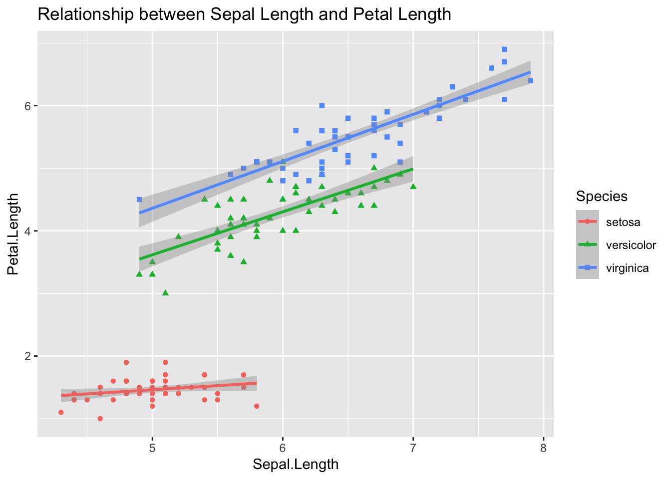
Discrete scales:
scale_fill_discrete(): Modifies fill colors for discrete variables.scale_color_discrete(): Modifies the color aesthetic for discrete variables.
ggplot(mpg, aes(x = class, fill = class)) +
 geom_bar() +
 scale_fill_brewer(palette = "Spectral", name = "Car Class")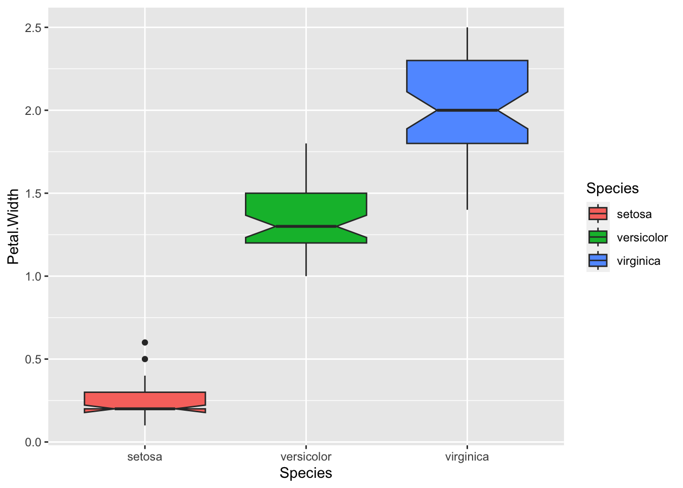
Color scales1:
scale_color_gradient(): Controls the color gradient for continuous variables.scale_color_manual(): Allows setting custom colors for specific values.
ggplot(mpg, aes(x = displ, y = hwy, color = hwy)) +
 geom_point() +
 scale_color_gradient(low = "blue", high = "red")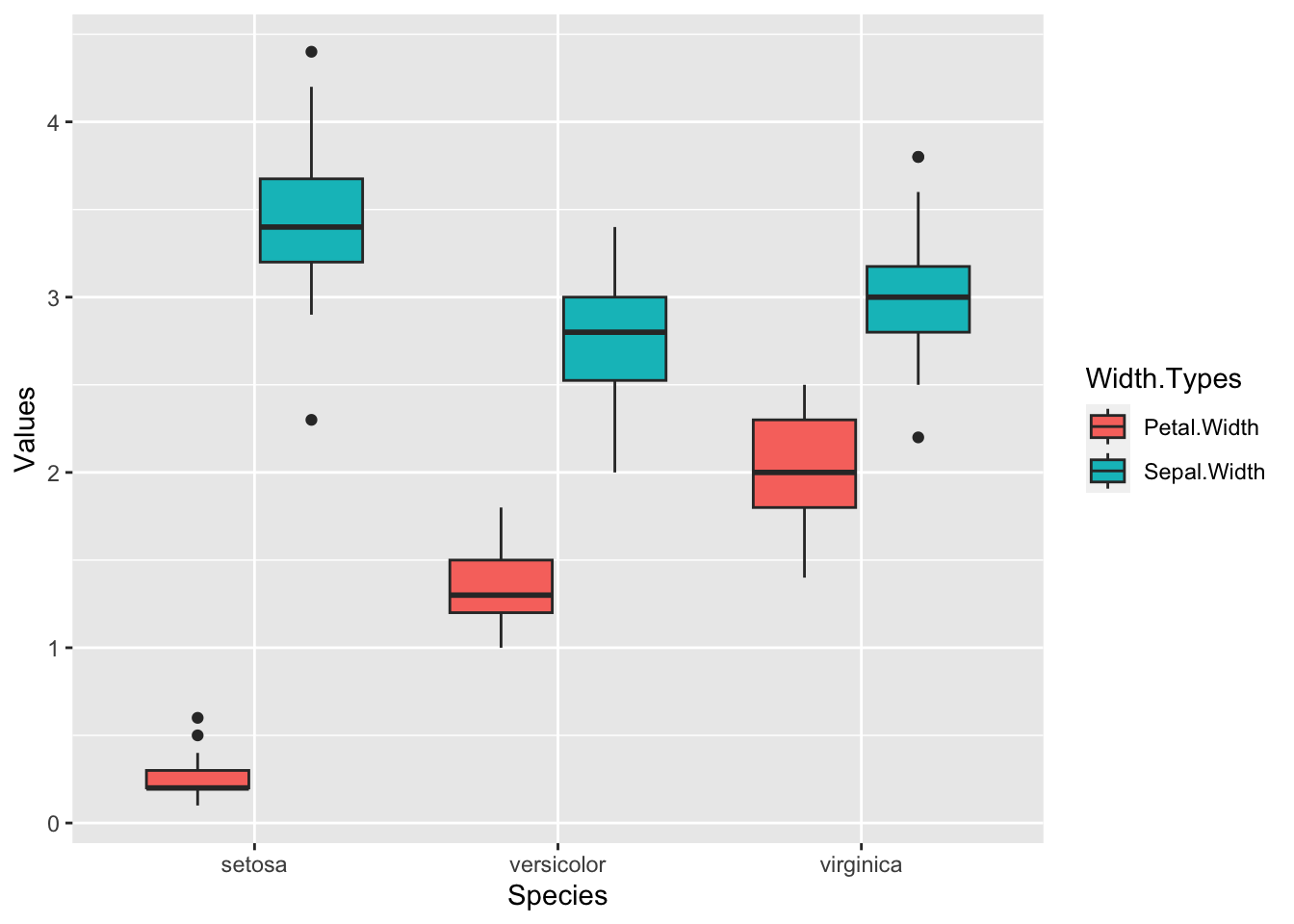
ggplot(mpg, aes(x = class, fill = class)) +
 geom_bar() +
 scale_fill_manual(values = c("red","orange","yellow", "blue", "green", "purple","pink"))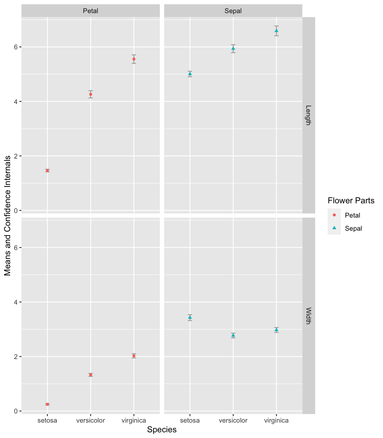
Logarithmic and square root scales:
scale_x_log10(): Applies a logarithmic transformation to the x-axis.scale_y_sqrt(): Applies a square root transformation to the y-axis.
These scale_*_*() functions are essential for controlling the appearance and interpretation of plots, providing flexibility to adjust axes, color gradients, and more.
7.9 Saving Plots
Saving a ggplot can be easily done by ggsave(). You can first assign a ggplot object to a variable and then use ggsave() to output the ggplot object to an external file.
It is recommended to use common image formats for publications, e.g., png, jpg.
Also, please remember to set the width and height (in inches) of your graph. These settings will greatly affect the look of the graph in print.
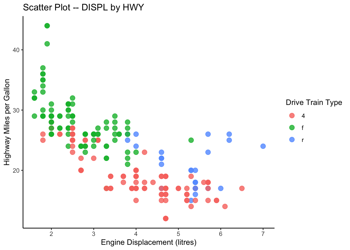
my_first_graph <-
  ggplot(data = mpg, aes(x = displ, y = hwy, color = drv)) +
  geom_point() +
  labs(x = "Engine Displacement (litres)",
       y = "Highway Miles per Gallon",
       title = "Scatter Plot -- DISPL by HWY")
class(my_first_graph) # check the class
[1] "gg" "ggplot"# summary(my_first_graph) # check the properties of the graph
my_first_graph # auto-print the ggplot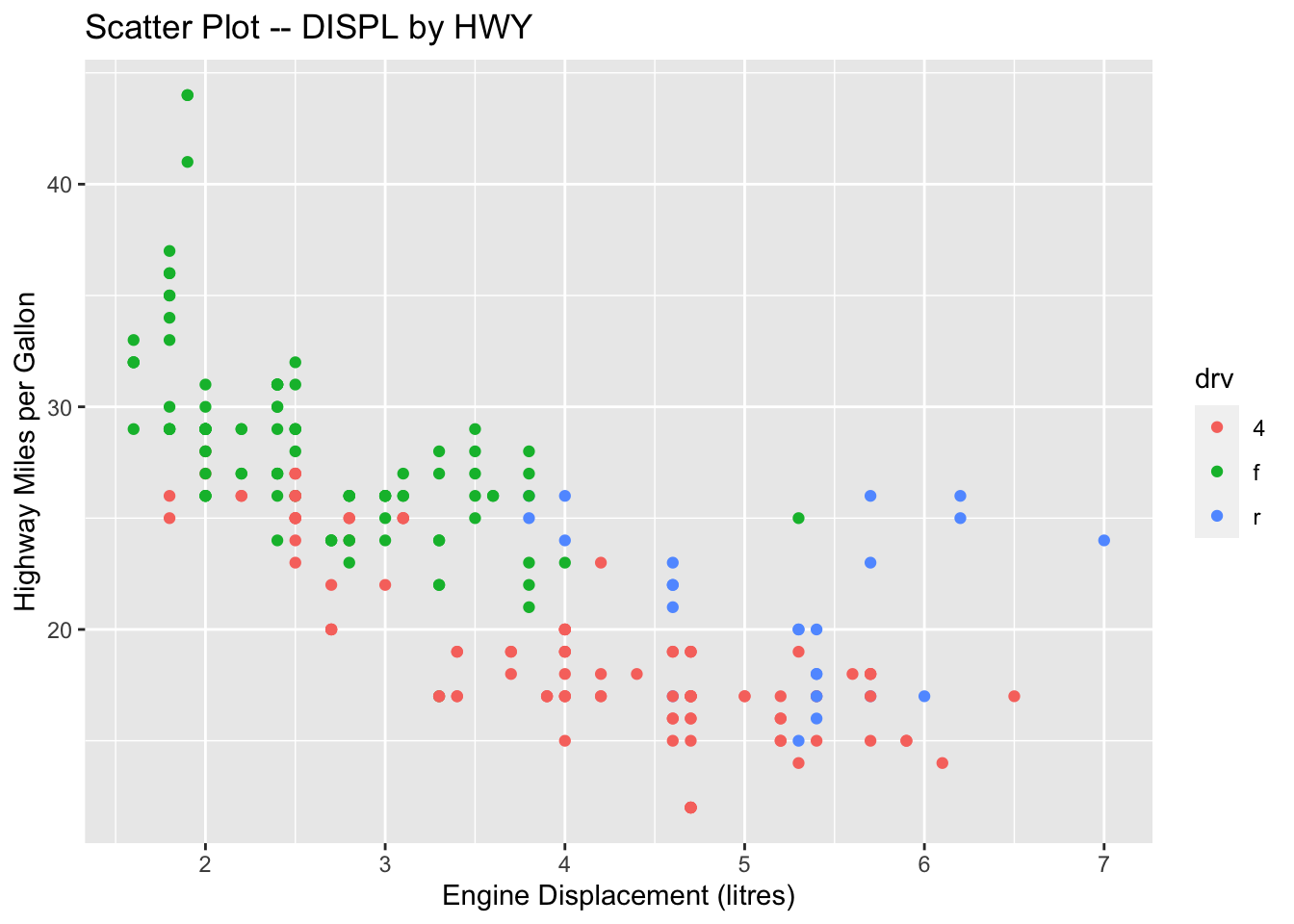
Useful References
The R Graph Gallery is a website where you can find lots of fancy graphs created with R. Most importantly, you can study their R codes and learn how to create similar fancy graphs with your own data. Highly recommend it!!
The
ggplot2Official Documentation Website provides a comprehensive list of all functions included in the package. Very useful!R Graphics Cookbook, 2nd Edition is a great on-line book, which provides hundreds of examples of high-quality graphs produced with R.
7.10 Exercises on iris
The following exercises will use the preloaded dataset iris in R.
Exercise 7.5 Please create a scatter plot showing the relationship between Sepal.Length and Petal.Length for different iris Species. Also, please add the regression lines for each species. Your graph should look as close to the sample as possible.
Please create a boxplot showing the Petal.Width distributions of each iris Species.
Exercise 7.6 Please make boxplots that display the distributions of Petal.Width and Sepal.Width for different iris Species on a single graph.
To accomplish this task, you may have to convert your data into a longer format, which you can achieve using tidyr::pivot_longer(). Please refer to Chapter 8 for assistance with this exercise.

Exercise 7.7 Create an error plot that displays the means and confidence intervals of the Petal.Width, Petal.Length, Sepal.Width, and Sepal.Length for each of the three iris species in the iris dataset.
In the final plot, the error bars should be presented according to flower parts (Sepal or Petal) and measurement types (Width or Length) in separate panels.
To calculate the confidence intervals, use mean_cl_normal(). You may need to reference the materials in Chapter 8 to effectively transform and manipulate the data required for this exercise.

7.11 Exercises on COVID-19
The exercises in this section utilize a dataset obtained from Kaggle, which can be found in demo_data/data-covid19.csv.
To successfully complete these exercises, you may need to reference the materials in Chapter 8 beforehand.
Exercise 7.8 Load the dataset in demo_data/data-covid19.csv into R as a data frame named covid19.
Hint: Check readr::read_csv()
In this dataset, it’s important to note that the Confirmed, Deaths, and Recovered columns all contain cumulative counts of COVID-19 cases, deaths, and recoveries, respectively, on different days. This cumulative data allows us to track the progression of the disease over time.
Additionally, for countries such as Mainland China, the data is reported by Province/State (same for US). To obtain the total number of confirmed cases on a specific day for the entire country, you will need to sum up the numbers from each individual province or state first.
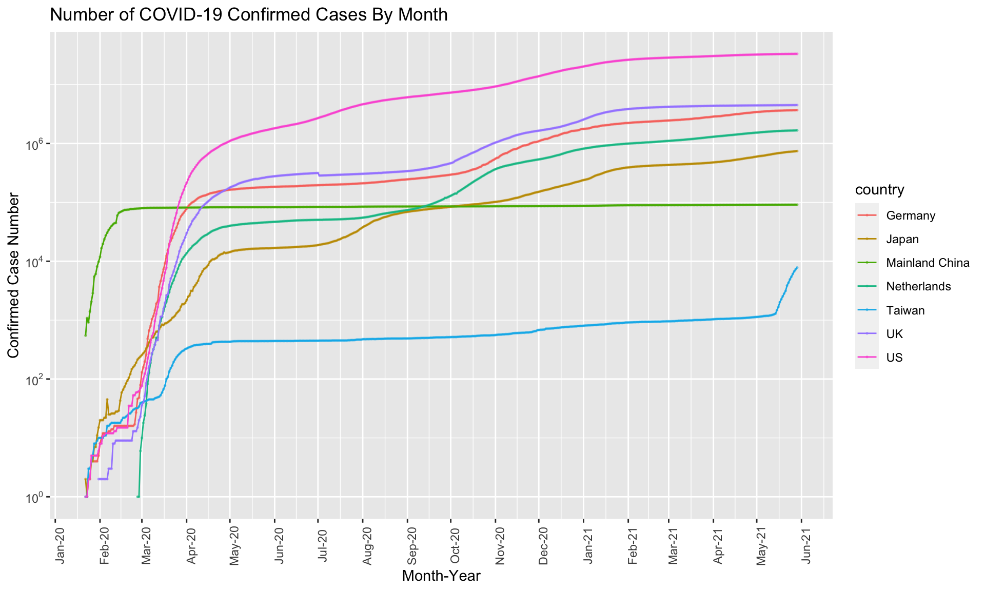
Exercise 7.9 Use ggplot2 to create a line plot showing the number of confirmed cases by month for the following countries: Taiwan, Japan, US, UK, Germany, Netherlands, Mainland China. A sample graph is provided below.
Hint: Please check the documentation of ggplot2 on Annotations: Log ticks marks.
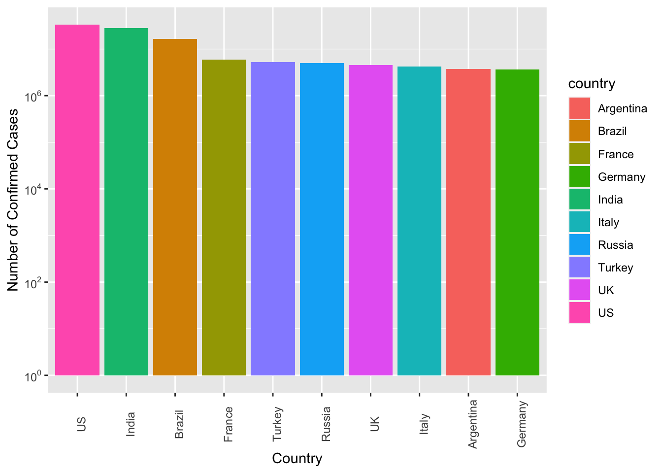
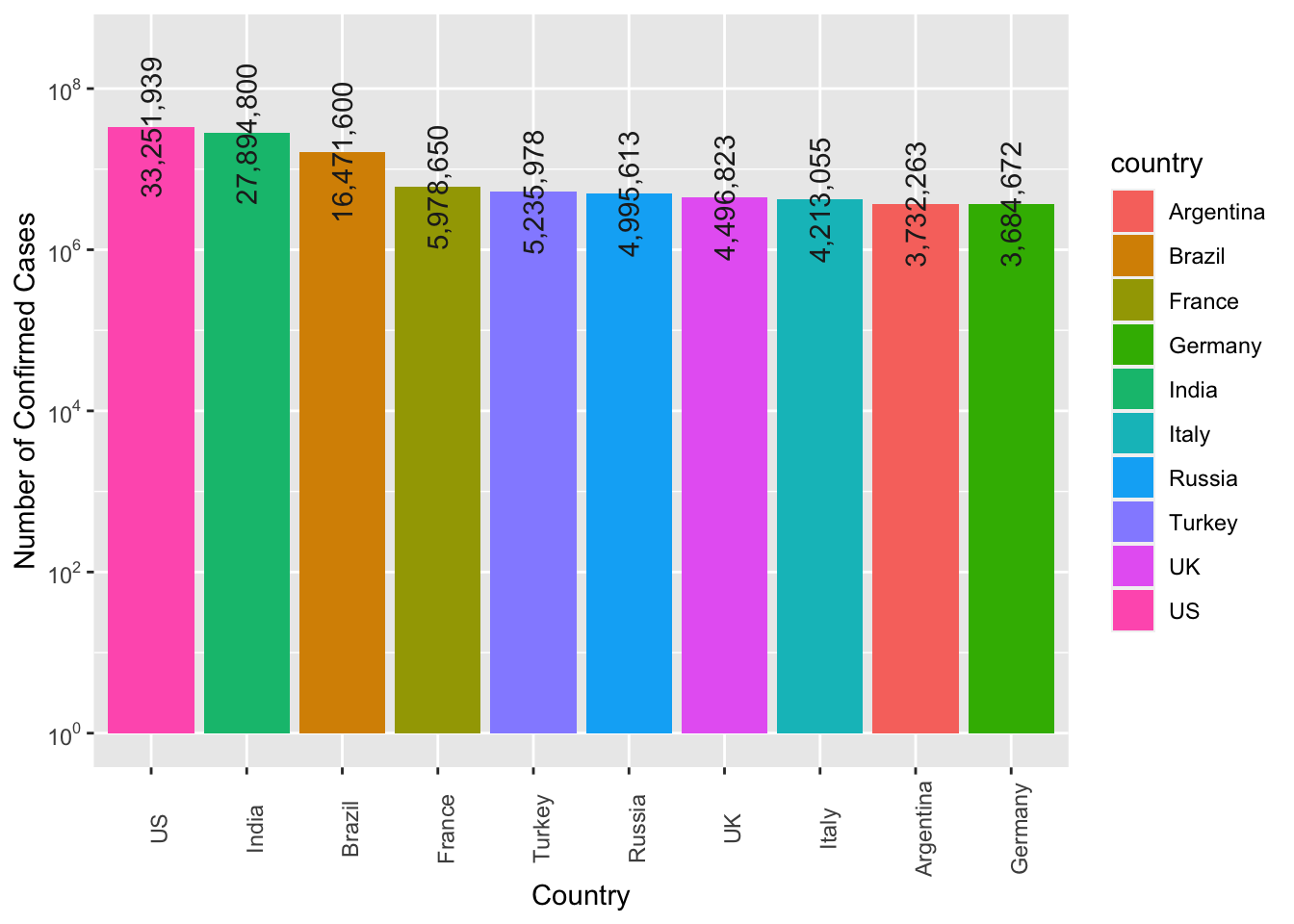
Exercise 7.10 Create a bar plot showing the top 10 countries ranked according to their number of confirmed cases of the COVID19.
The numbers of confirmed cases are included on top of the bars for reference.
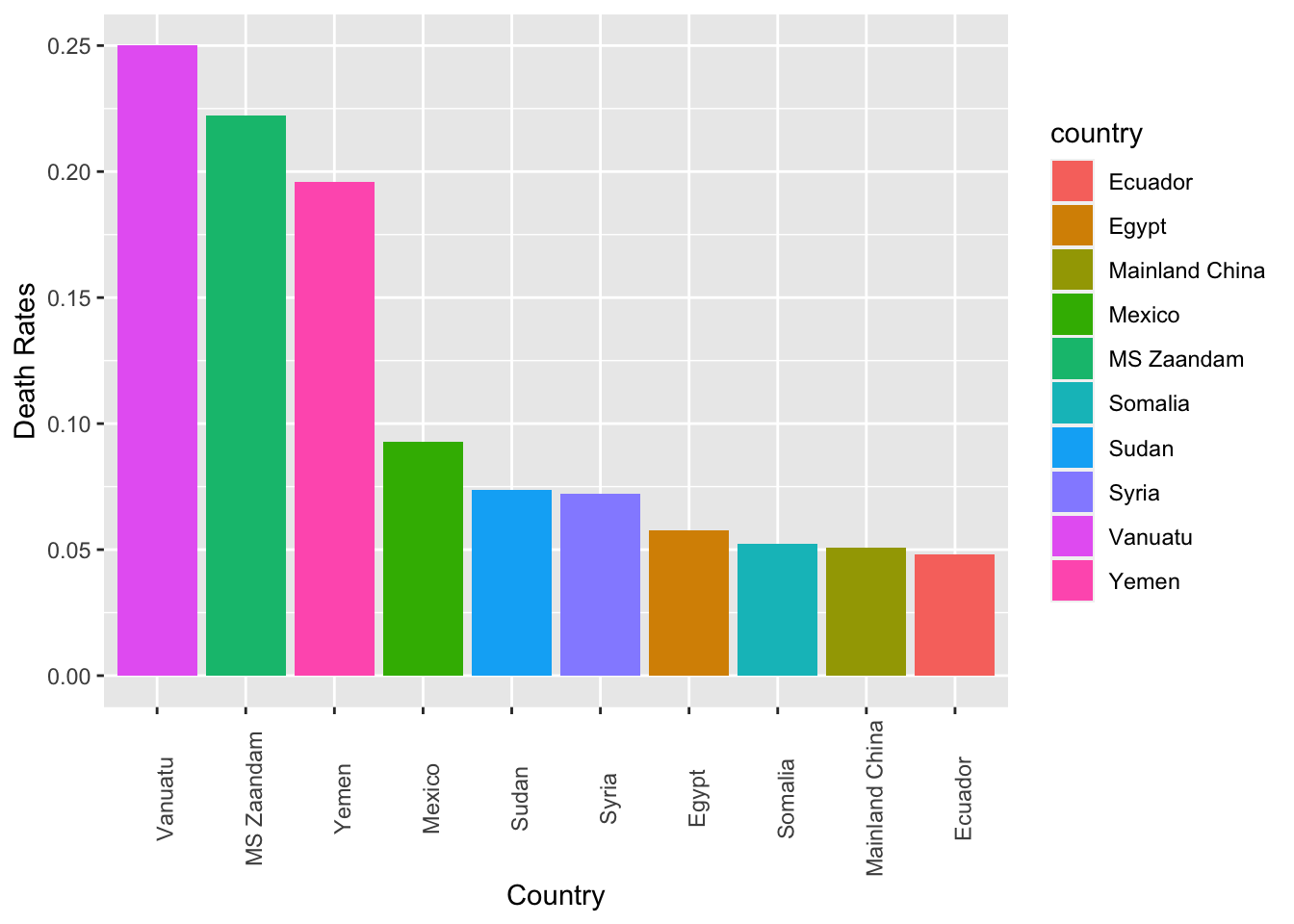
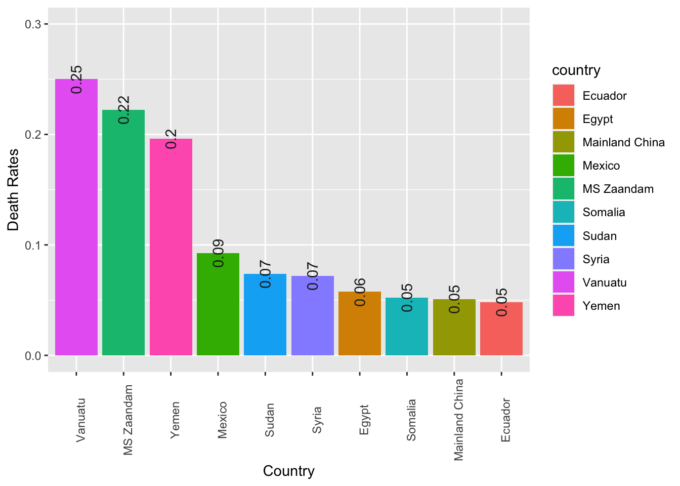
Exercise 7.11 Create a bar plot showing the top 10 countries ranked according to their death rates of the COVID19. (Death rates are defined as the number of deaths divided by the number of confirmed cases.)
The numbers of death rates are included on top of the bars for reference.
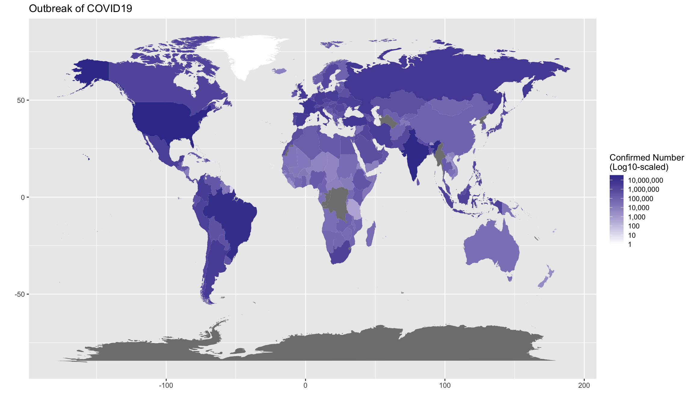
Exercise 7.12 (BONUS(Optional!!)) Create a world map showing the current outbreak of covid19.
Hint: Please check ggplot2::geom_polygon() and the package library(maps). This exercise is made to see if you know how to find resources online for more complex tasks like this. Please note that the country names may not match.