Chapter 8 Data Manipulation


In this chapter, we will be introducing two powerful R packages, dplyr and tidyr, which are designed to simplify and streamline data manipulation and exploration tasks. These packages provide a consistent and intuitive “grammar” for working with data frames, which are a fundamental data structure in R.
We first load the library:
The dplyr package in R provides a set of key verbs that are used for data manipulation tasks. These verbs make it easy to perform common data manipulation operations in a concise and intuitive way. Here is a brief overview of each of the key verbs:
%>%: This is the “pipe” operator, which is used to connect multiple verb actions together into a pipeline. It allows you to easily chain together different data manipulation actions, making it easier to perform complex manipulations with just a few lines of code.mutate(): This verb is used to add new variables or transform existing variables in a data frame. It allows you to create new columns based on calculations or transformations of existing columns.select(): This verb is used to return a subset of the columns of a data frame. It allows you to select specific columns or exclude columns based on column names, column indices, or logical conditions.filter(): This verb is used to extract a subset of rows from a data frame based on logical operators. It allows you to filter rows based on conditional subsetting.group_by(): This verb is used to group a data frame into sub-tables according to a grouping factor. It allows you to create groups based on one or more variables, and then perform calculations or summarizations on each group separately.summarise(): This verb is used to generate summary statistics of different variables in a data frame. It allows you to calculate summary statistics such as mean, median, or standard deviation for one or more variables, possibly within strata.arrange(): This verb is used to reorder the rows of a data frame according to a particular variable. It allows you to sort the rows of a data frame in ascending or descending order based on one or more variables.rename(): This verb is used to rename variables in a data frame. It allows you to rename one or more variables by specifying the new names as a named vector.
In the second library tidyr, we will focus on:
pivot_longer(): to tidy the data from wide to longpivot_wider(): to tidy the data from long to wide
Exercise 8.1 In dplyr, there are several useful functions for joining two data frames based on a common set of variables:
inner_join()left_join()right_join()full_join()anti_join()
Please check the documentations of all the above functions of merging data frames. Now suppose you have two data frames: orders and customers, as shown below. The orders data frame contains information about customer orders, and the customers data frame contains information about customers.
Show your code that produces the following merged versions of the two data sets:
orders <- data.frame(
  order_id = c(1, 2, 3, 4, 5),
  customer_id = c(101, 102, 103, 104, 105),
  product = c("A", "B", "C", "A", "D"),
  stringsAsFactors = FALSE
)

customers <- data.frame(
  customer_id = c(101, 102, 103, 104, 106),
  name = c("Alice", "Bob", "Charlie", "Dave", "Eve"),
  age = c(30, 25, 35, 40, 45),
  stringsAsFactors = FALSE
)- Version A
- Version B
- Version C
- Version D
8.1 Dataset
The dataset we use in this chapter is a student performance dataset from kaggle.
Usually we would start from an overview of the dataset, using summary() and str():
    gender          race/ethnicity     parental level of education
 Length:1000        Length:1000        Length:1000
 Class :character   Class :character   Class :character
 Mode  :character   Mode  :character   Mode  :character


    lunch           test preparation course   math score     reading score
 Length:1000        Length:1000             Min.   :  0.00   Min.   : 17.00
 Class :character   Class :character        1st Qu.: 57.00   1st Qu.: 59.00
 Mode  :character   Mode  :character        Median : 66.00   Median : 70.00
                                            Mean   : 66.09   Mean   : 69.17
                                            3rd Qu.: 77.00   3rd Qu.: 79.00
                                            Max.   :100.00   Max.   :100.00
 writing score
 Min.   : 10.00
 1st Qu.: 57.75
 Median : 69.00
 Mean   : 68.05
 3rd Qu.: 79.00
Max. :100.00 spc_tbl_ [1,000 × 8] (S3: spec_tbl_df/tbl_df/tbl/data.frame)
$ gender : chr [1:1000] "female" "female" "female" "male" ...
$ race/ethnicity : chr [1:1000] "group B" "group C" "group B" "group A" ...
$ parental level of education: chr [1:1000] "bachelor's degree" "some college" "master's degree" "associate's degree" ...
$ lunch : chr [1:1000] "standard" "standard" "standard" "free/reduced" ...
$ test preparation course : chr [1:1000] "none" "completed" "none" "none" ...
$ math score : num [1:1000] 72 69 90 47 76 71 88 40 64 38 ...
$ reading score : num [1:1000] 72 90 95 57 78 83 95 43 64 60 ...
$ writing score : num [1:1000] 74 88 93 44 75 78 92 39 67 50 ...
- attr(*, "spec")=
.. cols(
.. gender = col_character(),
.. `race/ethnicity` = col_character(),
.. `parental level of education` = col_character(),
.. lunch = col_character(),
.. `test preparation course` = col_character(),
.. `math score` = col_double(),
.. `reading score` = col_double(),
.. `writing score` = col_double()
.. )
- attr(*, "problems")=<externalptr> 8.2 rename()
The column names in the student data frame are not ideal. Some of these names include spaces, which can make it challenging to reference these columns in R. While this can be frustrating, it’s common to encounter messy data sets in the real world. Fortunately, we can easily rename the column names to be more R-friendly, allowing us to work with the data more effectively.
rename(student,
       race = `race/ethnicity`,
       parent_edu = `parental level of education`,
       prep_course = `test preparation course`,
       math = `math score`,
       reading = `reading score`,
       writing = `writing score`) -> student1
student1
Please note that in our earlier code, we save the output of rename() to a new object named student1. In other words, the object student1 should contain a new data frame with all column names corrected as shown.
Most importantly, the original data frame student is still available in the working memory. Even though we created a new object, the original data frame remains untouched, and we can still access it if we need to.
8.3 Pipe %>%
Next, we will explore the powerful pipe operator %>% in R, which is a popular R idiom for chaining multiple operations together. This operator is one of my favorites and can significantly simplify complex code.
Let’s begin by considering two expressions that are equivalent and produce identical results:
[1] 55[1] 55The pipe operator %>% is a powerful tool that passes the object returned by the expression on its left to the function on its right. Essentially, it enables a more readable and concise syntax for chaining multiple operations together.
By default, the object from the left-hand side is passed as the first argument of the function on the right-hand side.
This pipe-based syntax greatly enhances the readability of the code, making it easier to conceptualize complex operations. For example, consider the following code, which involves multiple layers of embedded structures: this code would be difficult to follow and understand without the use of the pipe operator.
[1] 10.48809But the above code can be re-written with the %>% as follows:
source_data <- c(-10:10) # create a vector

source_data %>%
  abs() %>%       # take each element's absolute value
  sum() %>%       # sum all elements
  sqrt()          # take the square root of the sum
[1] 10.48809The pipe operators make the entire codes more human-readable. With the pipe operator and formatting line breaks, developers can easily include annotations to improve their code readability, making it easier to communicate the thought process behind the code to others who may be reviewing or collaborating on the code.
Now we understand the idiomatic expression of %>%, our earlier rename() can be re-written as follows as well (cf. student1 and student1a):
student %>%
  rename(
    race = `race/ethnicity`,
    parent_edu = `parental level of education`,
    prep_course = `test preparation course`,
    math = `math score`,
    reading = `reading score`,
    writing = `writing score`
  ) -> student1a
student1a
From now on, we will use the pipe-based syntax more often.
The %>% pipe operator, which originates from the magrittr library, has become a ubiquitous tool within the tidyverse suite of packages. Nevertheless, with the release of R 4.1, a new native pipe operator, namely |>, has been introduced to the base R package.
c(-10:10) |>   # create a vector
  abs() |>      # take each element's absolute value
  sum() |>       # sum all elements
  sqrt()
[1] 10.48809For more detail, you can check this YouTube clip:
8.4 mutate()
Now imagine that you would like to create a new variable called final_grade, which is a weighted average of the student’s academic performance. Let us assume that you have the following weights in mind: math (50%), reading (25%), writing (25%). You can use mutate() to create a new column (i.e., variable) in your data frame:
We can create more than one new variables as well:
student1 %>%
  mutate(language = reading*0.5 + writing*0.5, ## new var 1
         final_grade = math + language) ## new var 2
In the above practices of mutate(), we did not save the output of mutate() to a new object name. We only print the output directly to the console. In other words, the original data frame is still the same (i.e., student, student1); no new variables have been created with respect to these original data frames.
8.5 select()
select() is to select particular columns of the data frame that you would like to focus on. You can perform conditional selection by specifying criteria for the column names.
- You can select just one column
- Or multiple columns:
- Through selection, you can re-order the columns as well:
- You can select columns within a range of column names:
- You can also remove columns using
select()
- You can easily perform conditional selection through
select()as well.
To make this process more convenient, dplyr provides a set of selection helpers that you can use to filter columns based on various criteria. These helpers enable you to select columns that match certain patterns or conditions, such as columns that start with a certain string (starts_with()), columns that contain a specific character string (contains()), or columns that satisfy a regular expression (matches()). By using these helpers, you can easily and efficiently perform complex column selection operations without having to write lengthy code.
8.6 filter()
While select() subsets columns, filter()subsets rows. Most importantly, we can perform conditional selection on rows as well, i.e., to extract specific rows that meet specific criteria. One of the primary use cases for filter() is to extract rows based on their values in a particular column (i.e., variable).
- one logical condition
- AND
&conditions:
- OR
|conditions:
- XOR
xorconditions:
Please check the row numbers of the above three filtered data frames. Any connection?
Please check Chapter 4.1 Vector and Chapter 5 Conditions for more logical operations.
Exercise 8.2 Suppose you have a data frame my_data with the following columns: “name”, “age”, “gender”, “income”, “education”, “occupation”. Write a single dplyr pipeline that accomplishes the following tasks:
- Filter the rows to include only those where the “gender” variable is “male”
- Filter the rows to include only those where the “education” variable is either “bachelor” or “master”
- Select only the columns “name”, “age”, and “occupation”.
Please note that all of the above data transformations should be completed using a single pipeline of code. You cannot use multiple pipelines to perform the specified operations.
## Your code should look like this:

my_data %>%
  ....... %>%
  ....... %>%
  ....... %>%
  ....... %>%
  .......

## The resulting data frame will autoprint itself in the console
library(dplyr)

my_data <- data.frame(
  name = c("Alice", "Bob", "Charlie", "David", "Emily"),
  age = c(25, 30, 40, 35, 27),
  gender = c("female", "male", "male", "male", "female"),
  income = c(55000, 60000, 45000, 70000, 50000),
  education = c("bachelor", "master", "bachelor", "doctorate", "master"),
  occupation = c("engineer", "teacher", "lawyer", "doctor", "writer")
)

my_data- Your single pipeline code should produce the following:
8.7 arrange()
We can arrange the rows of the data frame according to a particular column/variable.
In R, the default sorting order for rows is ascending. To sort your data in descending order, you can use the desc() function on the variable name.
8.8 group_by() and summarize()
group_by() and summarize() are two functions that are often coupled together to generate summary statistics from a data frame by grouping the data based on a particular variable or factor.
They are commonly used to analyze data by specific subgroups, such as gender, age, or location, allowing for deeper insights into the data. For example, in the dataset of student1, we can potentially group students into sub-groups in terms of their gender, age, or parental education levels.
student1 %>%
  group_by(gender) %>%
  summarize(math_average = mean(math),
            math_median = median(math),
            math_sd = sd(math))
In the above example, we use group_by(gender) to split the original data into two sub data frames (i.e., one for male students and another for female students) based on students’ gender. Then, we use summarize() to compute summary statistics (i.e., mean, median, or standard deviation of the math scores) for each gender subgroup.

In other words, summarize() allows us to apply specific functions to every sub data frame created by group_by(). Therefore, in the output data frame created by summarize(), its row number should be the same as the number of the grouping factor’s levels.
In summary, group_by() and summarize() are essential tools for exploring and analyzing data by subgroups. They work in two steps:
- We split the data frame into smaller sub data frames based on a grouping variable using
group_by(); - We summarize each sub data frame with specific statistics/functions using the
summarize().
In summarize(), there are a lot of powerful and useful functions that can be applied to the sub-data-frames created by group_by(). Please check the documentation of summarize() to learn how to use the following functions within summarize():
- Center:
mean(),median() - Spread:
sd(),IQR(),mad() - Range:
min(),max(),quantile() - Position:
first(),last(),nth(), - Count:
n(),n_distinct() - Logical:
any(),all()
Another more complex example. We can quickly extract the number of students by gender and at the same time extract the 90%-quantile and 10%-quantile of their math scores by each gender group.
student1 %>%
  group_by(gender) %>%
  summarize(N=n(),
            RANK90TH=quantile(math, 0.9),
            RANK10TH=quantile(math, 0.1))
Exercise 8.3 Using the student1 dataset, create a single pipeline of code that computes the percentage of students who fail on their maths (i.e., have a math score less than 60) for each gender. Please report the results as percentages rounded to the second decimal point.
8.9 count()
One of the most-often used feature when we have data frames is to tally the frequencies of the subjects according to some of the columns. These columns are often categorical variables in the forms of character or factor (serving as grouping factors).
The function count() is born for this. For example, we can create a frequency distribution of male and female students of different parental levels of education (i.e., parent_edu x gender contingency table):
The function count() can be seen as a short-hand for group_by() + summarize(). Can you create the same frequency distributions as above using only group_by() and summarize()?
Exercise 8.4 Continuing the above example, how can you create another column, which includes the percentage of male and female students for those of the same parental level education (see below)?
Exercise 8.5 Suppose you have a data frame called my_data with the following columns: “id”, “name”, “gender”, “age”, “income”, “education”, and “occupation”. Write a dplyr pipeline that performs the following operations:
- Filter out rows where the “gender” variable is missing or where the “age” variable is less than 18 or greater than 65.
- Group the resulting data frame by “gender”.
- For each group, calculate the mean and standard deviation of “age” and “income”, the percentage of people with a graduate degree (“education” > “college”), and the percentage of people who are doctors or engineers.
- Round all numeric data to the second decimal point.
- Convert all the column names to uppercase.
- Arrange the resulting data frame by “mean_income” in descending order.
Please note that all of the above data transformations should be completed using a single pipeline of code. You cannot use multiple pipelines to perform the specified operations.
library(dplyr)

my_data <- data.frame(
  id = 1:10,
  name = c("Alice", "Bob", "Charlie", "Dave", "Eve", "Frank", "Grace", "Heidi", "Isaac", "Judy"),
  gender = c("F", "M", NA, "M", "F", "M", "F", "F", "M", "F"),
  age = c(25, 35, 45, 20, 60, 55, 40, 50, 30, 70),
  income = c(50000, 75000, 100000, 40000, 80000, 90000, 70000, 85000, 60000, 95000),
  education = c("high school", "college", "master", "high school", "college", "college", "master", "PhD", "college", "PhD"),
  occupation = c("teacher", "engineer", "manager", "sales", "analyst", "doctor", "teacher", "manager", "analyst", "doctor")
)
# Your code here- Your code should produce the following output:
8.10 Tidy Data
The concept of a tidy dataset is an important aspect of data science. According to Wickham & Grolemund (2017), a tidy dataset must adhere to the following three principles:
- Each variable should have its own column.
- Each observation should have its own row.
- Each value should have its own cell.
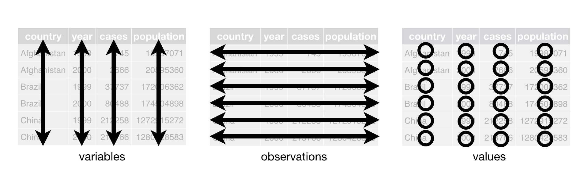
Despite these rules, real-life datasets are often not tidy. Rather than relying on others to clean up the data, it is crucial for data scientists to learn how to handle messy datasets themselves. Two common strategies for reshaping untidy datasets, as suggested by Wickham & Grolemund (2017), are:
- Spreading one variable across multiple columns (from long to wide;
pivot_wider()) - Gathering one observation scattered across multiple rows (from wide to long;
pivot_longer())
8.10.1 A Long-to-Wide Example
A common use case for data reshaping from long to wide is when values in a specific column could potentially be spread into several independent columns/variables.
Let’s consider a dataset of students’ exam scores in different academic subjects, where each student has multiple scores in different exams.
scores <- data.frame(
  student_id = factor(rep(1:5, each = 3)),
  subject = rep(c("math", "english", "science"), 5),
  score = sample(60:100, size = 15, replace = TRUE)
)

scores
The dataset is currently in a long format, which is not tidy because each subject/participant has more than one value in the dataset. In particular, the column subject contains values (i.e., math, english, science) that can be potentially spread into independent columns.
In other words, we can reshape the dataset into a wide format, where each row represents a single student and their scores in different academic subjects are in separate columns.
scores_wide <- scores %>%
  pivot_wider(
    names_from = subject,
    values_from = score,
    values_fill = 0
  )

scores_wide
The function tidyr::pivot_wider() reshapes the dataset into a wide format. There are two important parameters in pivot_wider():
names_from = ...: The column to take variable names from. Here it’ssubject.values_from = ...: The column to take values from. Here it’sscore.values_fill = ...: Default value to use for missing values in the new columns. In this case, we set it to 0 to represent missing exam scores.
Having data in a wide format makes it easier to work with the new variables that have been originally embedded. (It would be more difficult if we want to complete the following computation based on the original long dataset.)
scores_wide %>%
  mutate(gpa = math*0.3 + english*0.4 + science*0.3) %>%
  ggplot(aes(student_id, gpa, fill=student_id)) +
    geom_col() +
    labs(x = "Student ID", y = "GPA Scores", fill = "Student ID") +
  scale_fill_grey() +
  theme_bw()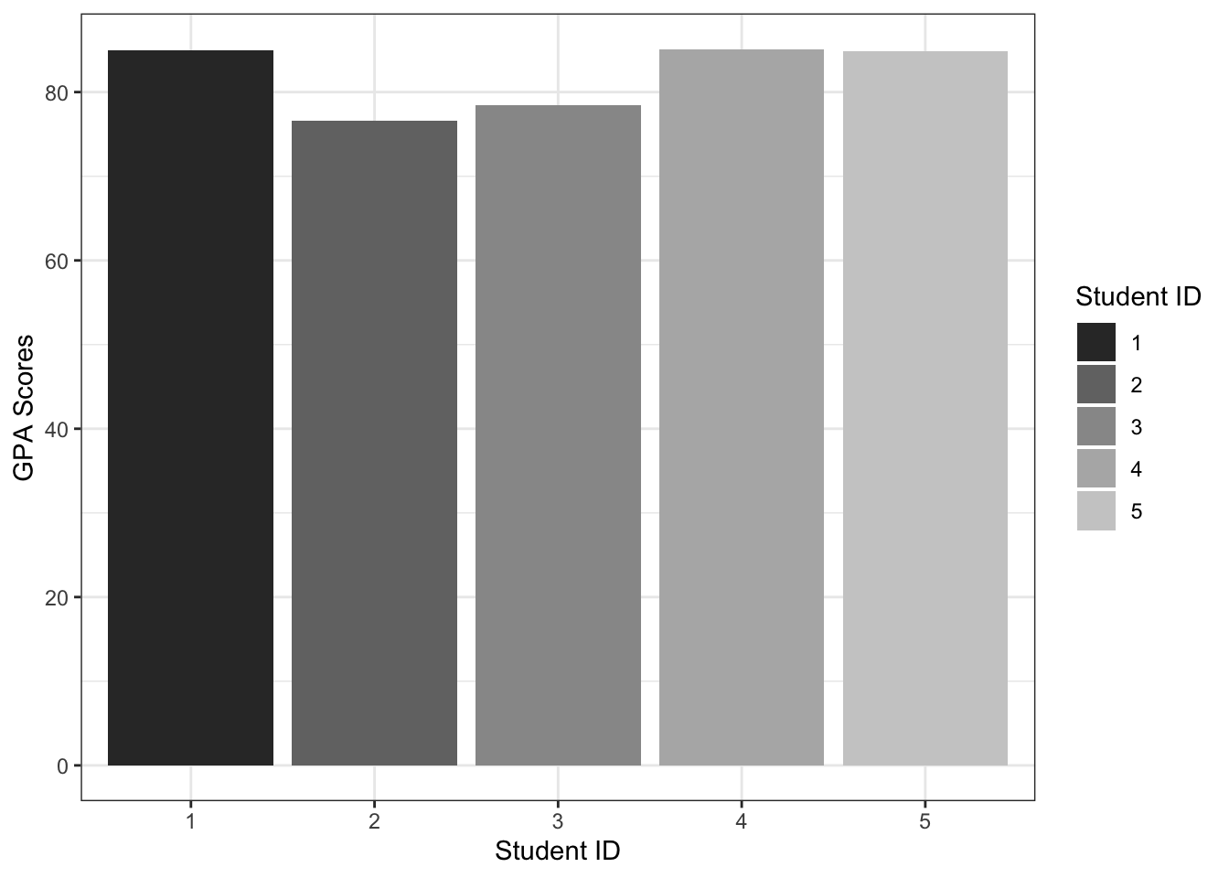
8.10.2 A Wide-to-Long Example
A common use case for data reshaping from wide to long is when working with datasets that contain repeated measures.
Let’s say we have a dataset with three variables: subject ID, pre-treatment blood pressure measurement, and post-treatment pressure measurement.
data <- data.frame(
  subject_id = c(1, 2, 3, 4),
  pre_treatment_bp = c(120, 130, 125, 118),
  post_treatment_bp = c(115, 127, 120, 112)
)

data
Using pivot_longer(), we can reshape the data so that we have a single column for time point (indicating whether it is pre- or post-treatment), and a single column for blood pressure measurements (indicating the BP measurement values):
data_long <- data %>%
  pivot_longer(
    cols = c("pre_treatment_bp", "post_treatment_bp"),
    names_to = "time_point",
    values_to = "bp_measurement"
  )

data_long
Now we can see that we have a new column time_point that specifies whether the measurement was taken pre- or post-treatment, and the bp_measurement column contains the actual blood pressure measurements.
The tidyr::pivot_longer() function is specifically designed for reshaping data from a wide format to a long format. This function takes three important parameters:
cols = ...: This parameter specifies the set of columns whose names will be converted into values of a new column.names_to = ...: This parameter specifies the name of the new variable that will contain the above column names after the transformation. In this case, the new column name is calledtime_point.values_to = ...: This parameter specifies the name of the new variable that will contain the values after the transformation. In this case, the new column name is calledbp_measurement.
The conversion of a data frame from a wide format to a long format is an important step in data analysis and visualization. By transforming the data frame into a long format and having one independent column/variable, such as time_point, we can perform statistical analysis and visualization more efficiently and effectively.
## Easier to plot boxplots
## for each time point
data_long %>%
  ggplot(aes(time_point, bp_measurement, fill = time_point)) +
  geom_boxplot()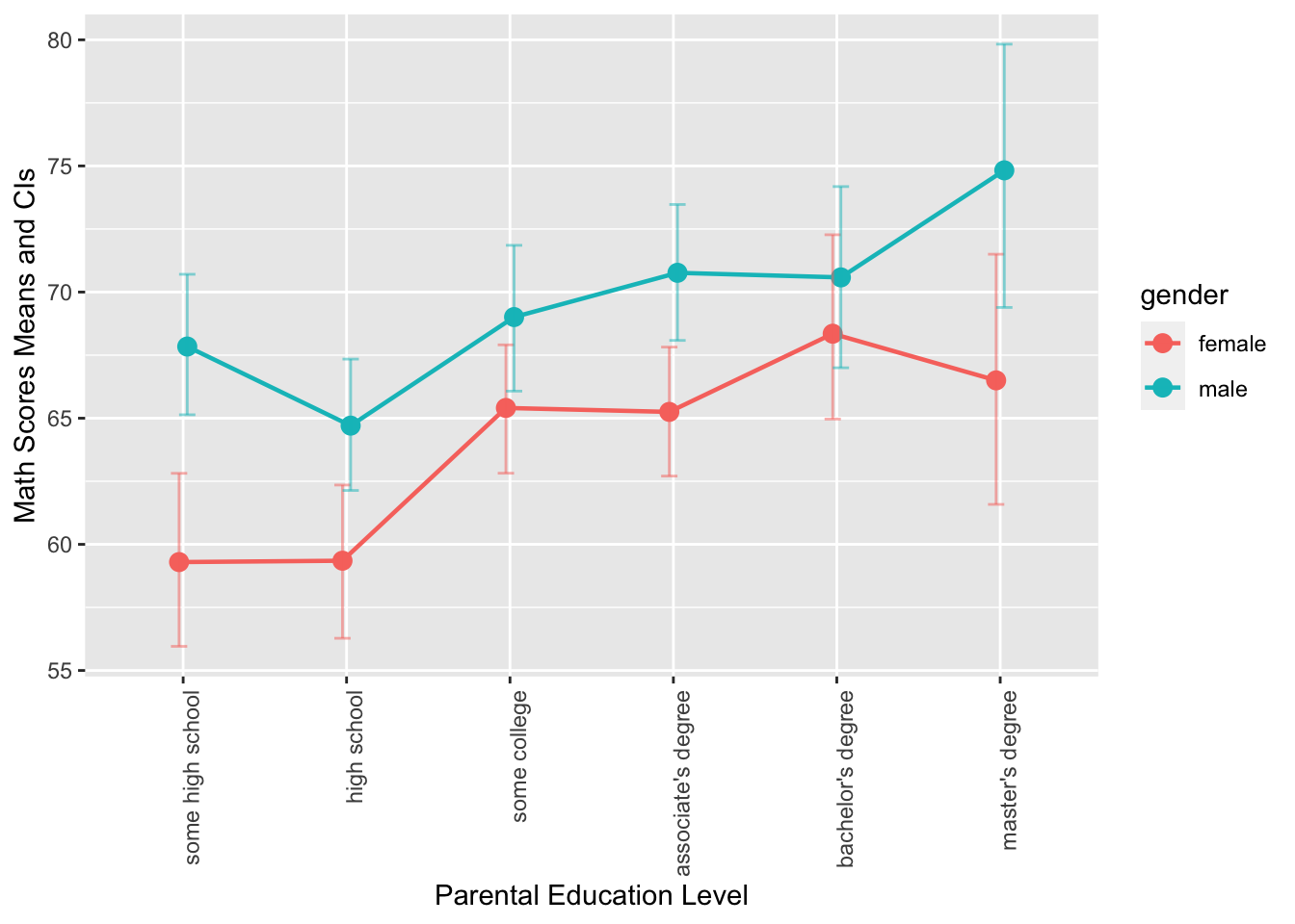
It seems to be more intuitive that we have the pre-treatment boxplot goes before (on the left) the post-treatment boxplot. Any idea on how to do this?
Notes on Repeated Measures Analysis (Statistics-savvy!!)
For repeated measures analysis, we convert the data frame from wide format to long format because long format is the preferred structure for most statistical models and functions in R, including repeated measures techniques like linear mixed-effects models (e.g., lme4::lmer()) and ANOVA for repeated measures (e.g., aov()). Here’s why:
Data Representation of Repeated Observations
- In wide format, each subject’s repeated measures (e.g., measurements taken at different time points or under different conditions) are stored in separate columns. Each row represents a single subject, and each column corresponds to a different time point or condition.
Example wide format:
ID Time1 Time2 Time3 001 5.3 5.9 6.1 002 4.8 5.1 5.4
- In long format, each observation (or measurement) gets its own row, with an additional column that indicates the time point or condition. The result is that each row represents one observation for one subject at one time point or condition.
Example long format:
ID Time Measurement 001 1 5.3 001 2 5.9 001 3 6.1 002 1 4.8 002 2 5.1 002 3 5.4
- In wide format, each subject’s repeated measures (e.g., measurements taken at different time points or under different conditions) are stored in separate columns. Each row represents a single subject, and each column corresponds to a different time point or condition.
Advantages of Long Format for Repeated Measures
- Explicit Identification of Time or Condition:
- In long format, each observation is associated with a specific time point or condition. This makes it easier to model within-subject effects (e.g., changes over time) and between-subject effects (e.g., differences between subjects).
- Appropriate for Statistical Models:
- Many statistical models, such as linear mixed-effects models or repeated measures ANOVA, expect the data to be in long format because they need to identify the repeated measures within each subject. These models can then appropriately estimate random effects or repeated measures variances.
- Handling Missing Data:
- In wide format, missing values in a time point or condition result in empty cells, which may be difficult to manage. In long format, missing values are easier to identify, and functions can properly handle them as missing observations.
- Visualization:
- Data visualization tools like
ggplot2work better with long format data, especially when generating faceted or grouped plots to explore repeated measures.
- Data visualization tools like
- Explicit Identification of Time or Condition:
Please get familiar with tidyr::separate() and tidyr::unite(), which are two important functions to manipulate the columns of the data frame.
Exercise 8.6 Suppose you have a data frame called my_data that contains measurements of a variable for different individuals at different days. The data frame has four columns: “id”, “day_1_value”, “day_2_value”, and “day_3_value”. Each row of the data frame represents a single measurement of the variable for a specific individual on a specific day.
Write a dplyr pipeline that performs the following operations:
- Calculate the minimum, maximum, and mean values of the measurements for each subject and store the results in new columns.
- Pivot the data frame longer so that the “minimum”, “maximum”, and “mean” values are combined into a single column called “ValueType”.
- Create a new column called “Value” that includes each individual’s record for each value type. This column will have the minimum, maximum, and mean values for each subject repeated for each value type.
- Round the numeric data to the second decimal point.
Please note that all of the above data transformations should be completed using a single pipeline of code. You cannot use multiple pipelines to perform the specified operations.
my_data <- data.frame(
  id = c(1, 2, 3, 4, 5),
  day_1_value = c(23, 25, 20, 21, 24),
  day_2_value = c(27, 29, 30, 28, 26),
  day_3_value = c(18, 19, 22, 20, 21)
)
my_data- Your expected output:
8.11 Exercises
Exercise 8.7 Using the dataset demo_data/data-students-performance.csv, load it into R and filter the data to show only female students with math scores less than 40. The output should display only the gender and math columns.”
Exercise 8.8 Using the same dataset from Exercise 8.7, compute the mean and standard deviation of math scores for different races. Additionally, please include the number of students for each race sub-group.
Exercise 8.9 Using the same dataset from Exercise 8.7, create a summary data frame that includes the following information for students of different genders and parental education levels:
- The number of students
- The mean math score
- The standard deviation of math score
Exercise 8.10 Using the same dataset from Exercise 8.7, transform the parent_edu variable in the dataset into an ordered factor, where the levels are defined according to the following order: some high school < high school < some college < associate's degree < bachelor's degree < master's degree.
Once the transformation is complete, create a summary data frame that includes the number of students, math mean scores, and math standard deviations, for students of different genders and parental education levels. The output should only include the following columns: gender, parent_edu, N, math_mean, and math_sd.
Ensure that the parent_edu variable is ordered in the summary data frame according to the specified levels.
Exercise 8.11 Using the same dataset from Exercise 8.7, create the following graphs using ggplot2. Your output graphs should be as close to the graphs provided below as possible.
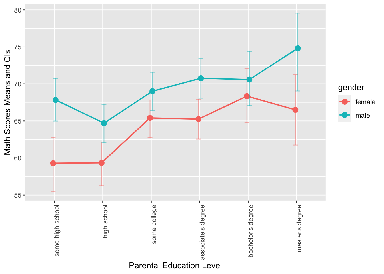
- This is a grouped error plot. This chart displays the mean math scores of male and female students across different levels of parental education, which is represented on the x-axis. The color of the error bars, points, and lines represents the gender of the students, and the error bars show the 95% confidence intervals (computed based on
mean_cl_boot()) of the mean math scores.
- This graph is a grouped bar plot with
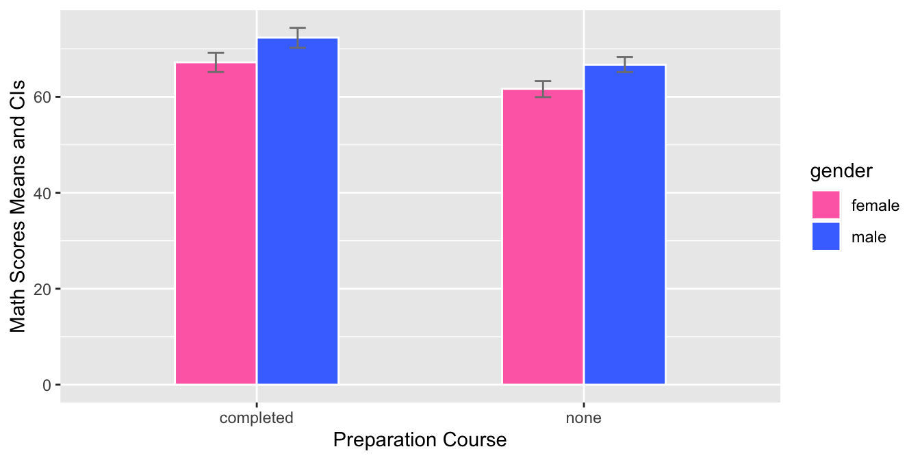
prep_courseon the x-axis andmathscores on the y-axis. The bars are grouped by gender and the mean score for each group is shown using a bar with error bars for the 95% confidence interval. The fill color of each bar corresponds to the gender. The graph allows the comparison of math scores between the two genders for each preparation course.

- This graph is a grouped bar plot with
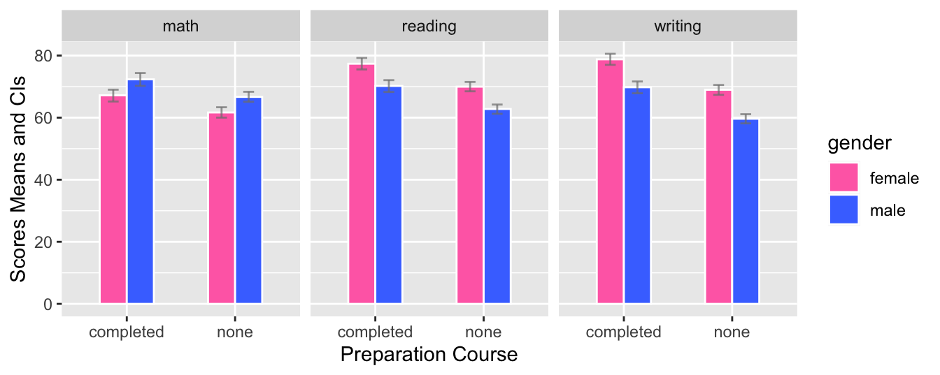
prep_courseon the x-axis andmath,reading, andwritingscores on the y-axis. The bars are grouped by gender and the mean score for each group is shown using a bar with error bars for the 95% confidence interval. The fill color of each bar corresponds to the gender. The graph is split into three facets, one for each academic subject. The graph allows the comparison of scores between genders for each preparation course and across different subjects.
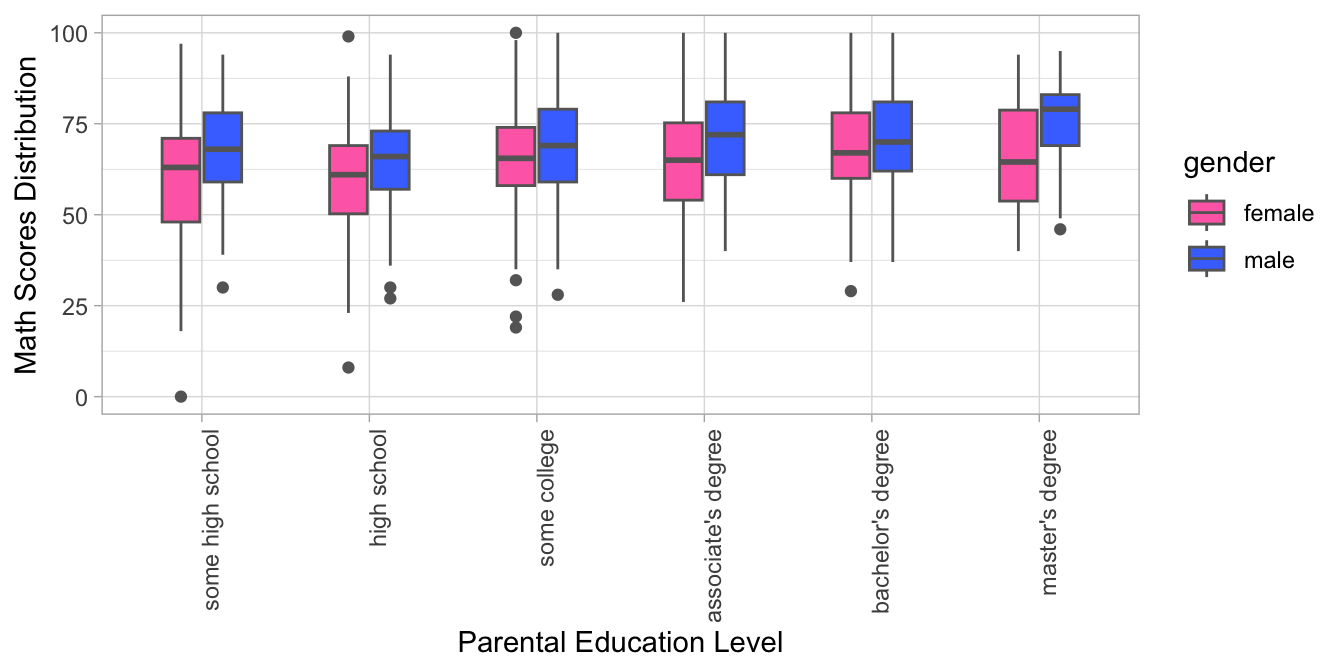
- The R code creates a grouped boxplot with one boxplot for each level of parental education and each gender. The fill color of the boxplots distinguishes between male and female students, and the x-axis displays the different levels of parental education, with labels aligned and rotated 90 degrees for readability. The y-axis shows the range of math scores in the dataset.
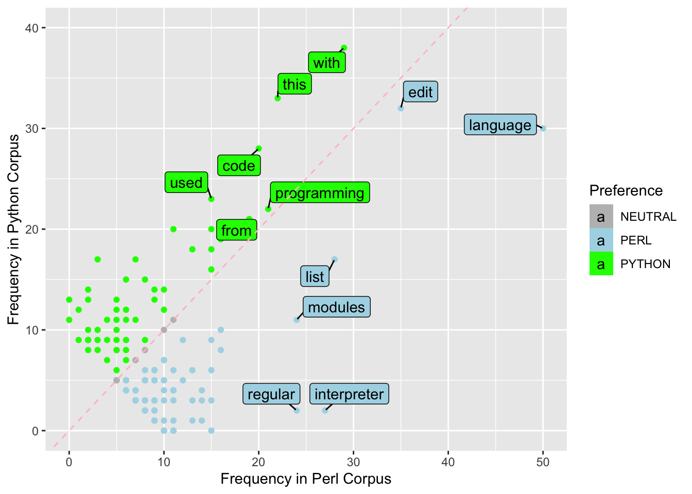
Exercise 8.12 In this exercise, please first download the dataset demo_data/data-word-freq.csv. You may use readr::read_csv() to load the dataset into R. This is a dataset including word frequencies in two different corpora. For example, the word the appears 346 times in perl corpus but 229 times in python corpus. In other words, each row in word_freq in fact represents the combination of (WORD, CORPUS) because the column FREQ contains the values for those variables. In addition, the same word appears twice in the dataset in the rows (e.g., the, a).
Please transform word_freq into a wider format, where the word frequencies in each corpus can be independent columns (as shown in the second table). If the word appears in only one of the corpora, its frequency would be 0.
Exercise 8.13 Using the dataset from Exercise 8.12, filter the dataset by including only words with four or more characters and where the sum of their frequencies in Perl and Python Corpus is between 10 and 100.
Then create a scatterplot with labeled points using ggplot2 and ggrepel. The x-axis represents the frequency of the word in Perl Corpus and the y-axis represents the frequency of the word in Python Corpus.
The points are colored according to the preference for either Perl or Python Corpus based on the difference in their frequency values in the two corpora (if the frequency values are the same in both corpora, the preference of the word is deemed neutral).
The words that have a frequency greater than 20 in either Perl or Python corpus are presented with word labels in the final graph.